Comparison of Geovisualization Methods
for Drought Impacts and Vegetation Trends
using Copernicus Data
A portfolio of cartographic design, data processing and interactive mapping
Mapping Drought and Vegetation change in Hungary
This website presents the main outcomes and workflow of my diploma thesis, from automated data processing to the final cartographic products. Using Copernicus Earth Observation data, reproducible GIS workflows and multiple geovisualization techniques, the project explores how complex drought and vegetation information can be transformed into clear, accessible and intuitive maps. Rather than producing highly technical scientific visualizations, the primary objective was to develop generalized cartographic representations that effectively communicate environmental change to non-expert audiences while supporting education, public awareness and decision-making.
Area Poligons Map
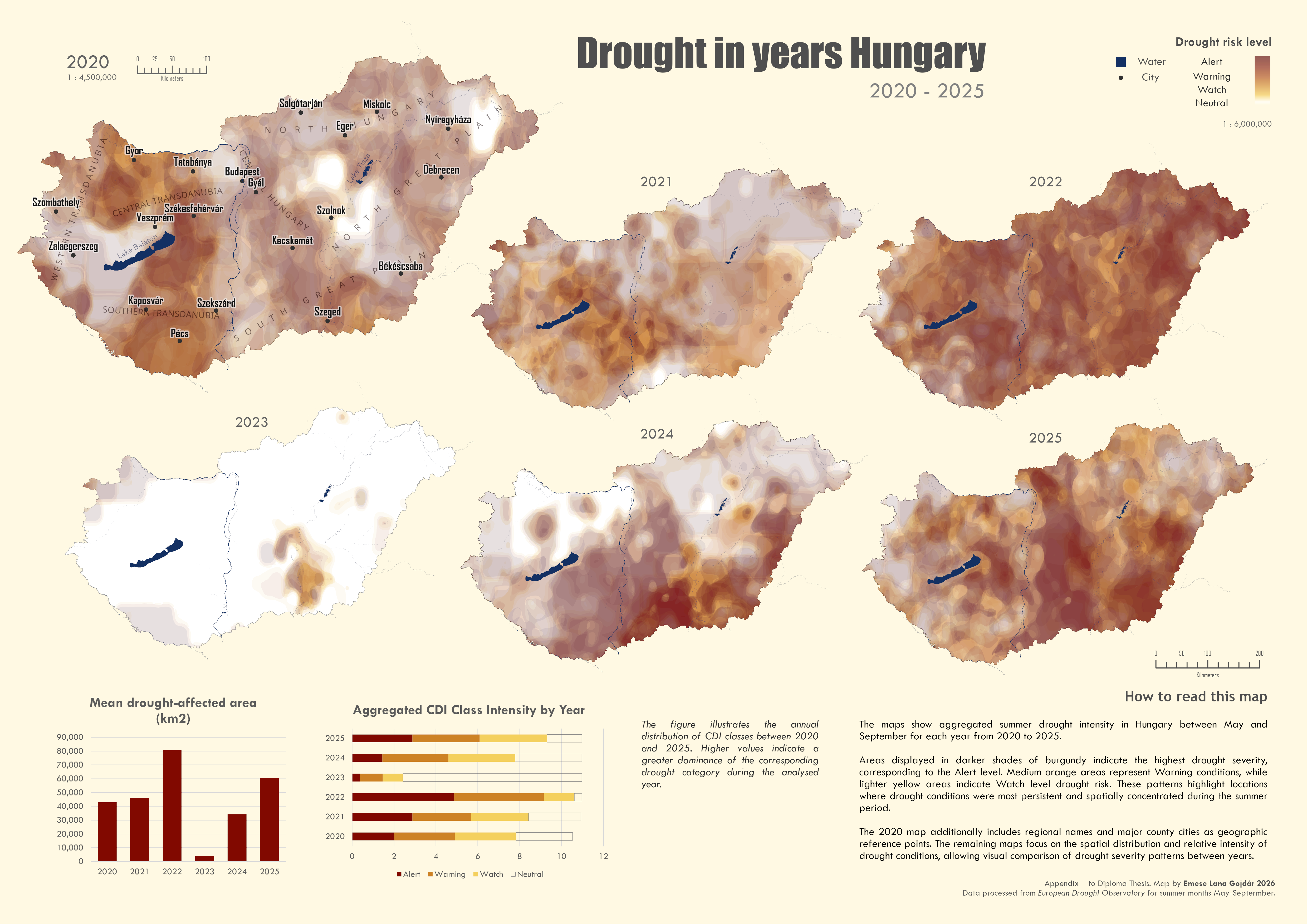
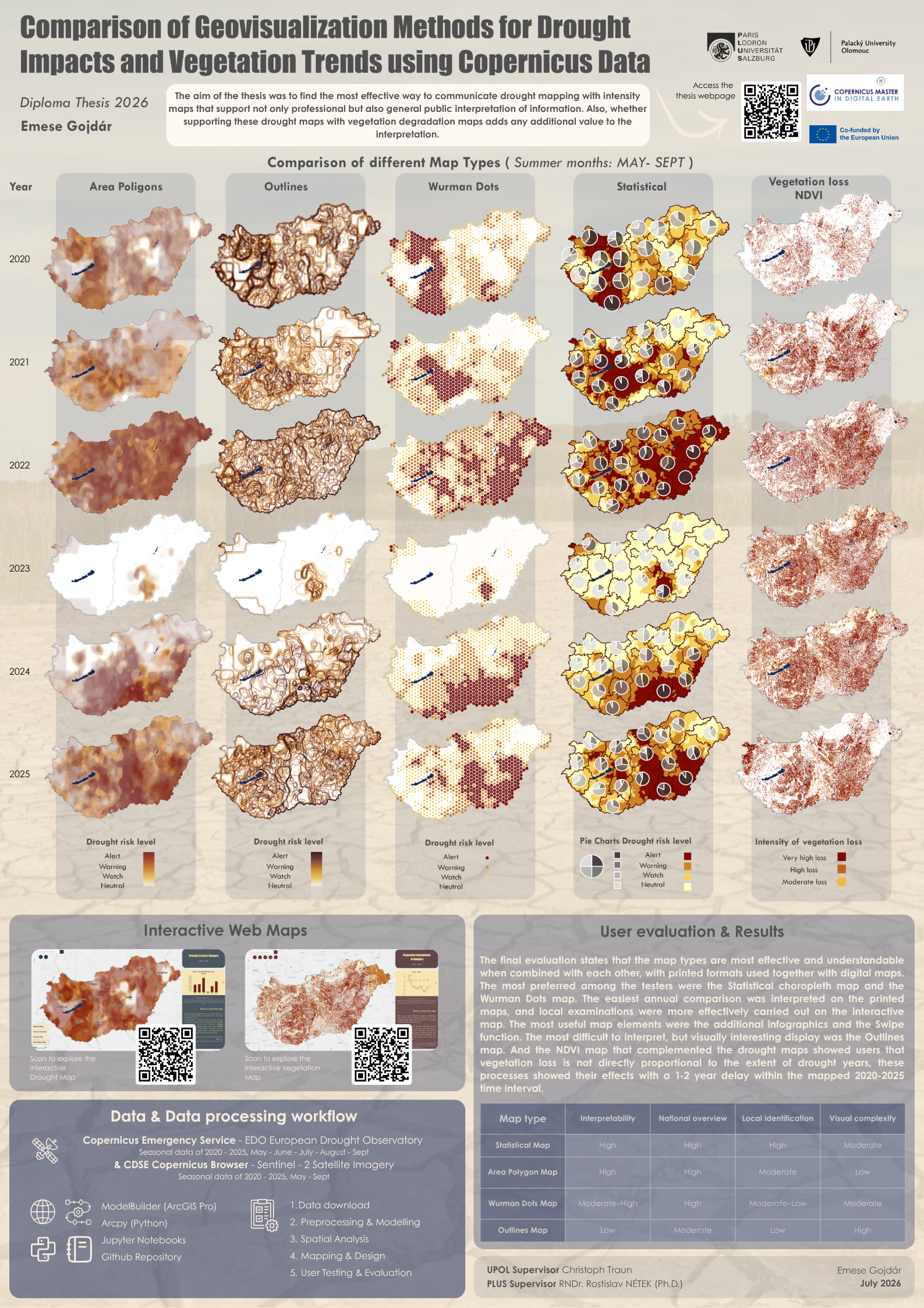
Aggregated drought polygons with overlapping display, symbolized on top of each other in annual breakdown from 2020 to 2025, seasonally from May to September. Layout was designed for printed out version.
Outlines Map
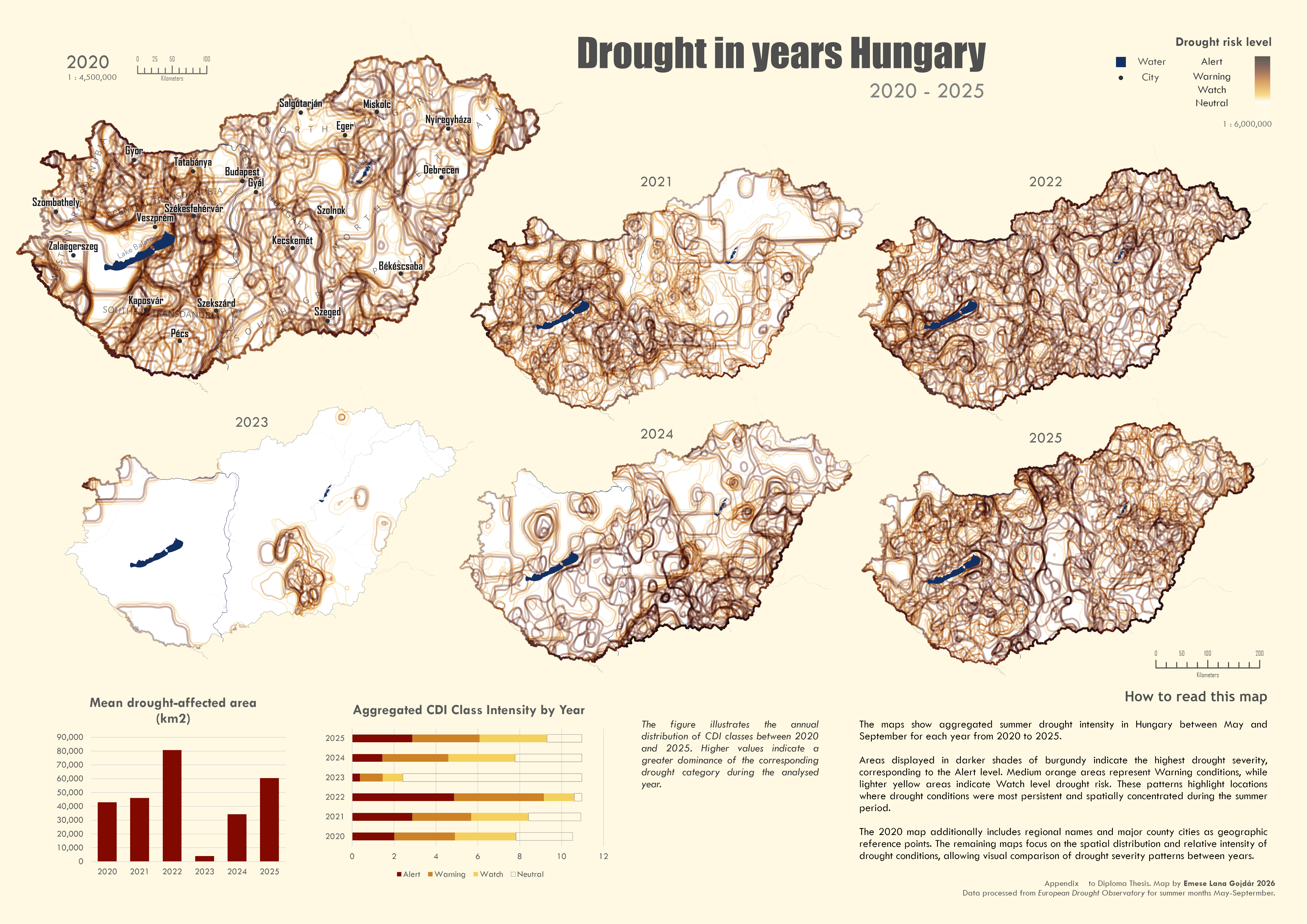
Aggregated drought polygon outlines with overlapping display, symbolized on top of each other in annual breakdown from 2020 to 2025, seasonally from May to September. Layout was designed for printed out version.
Wurman Dots Map
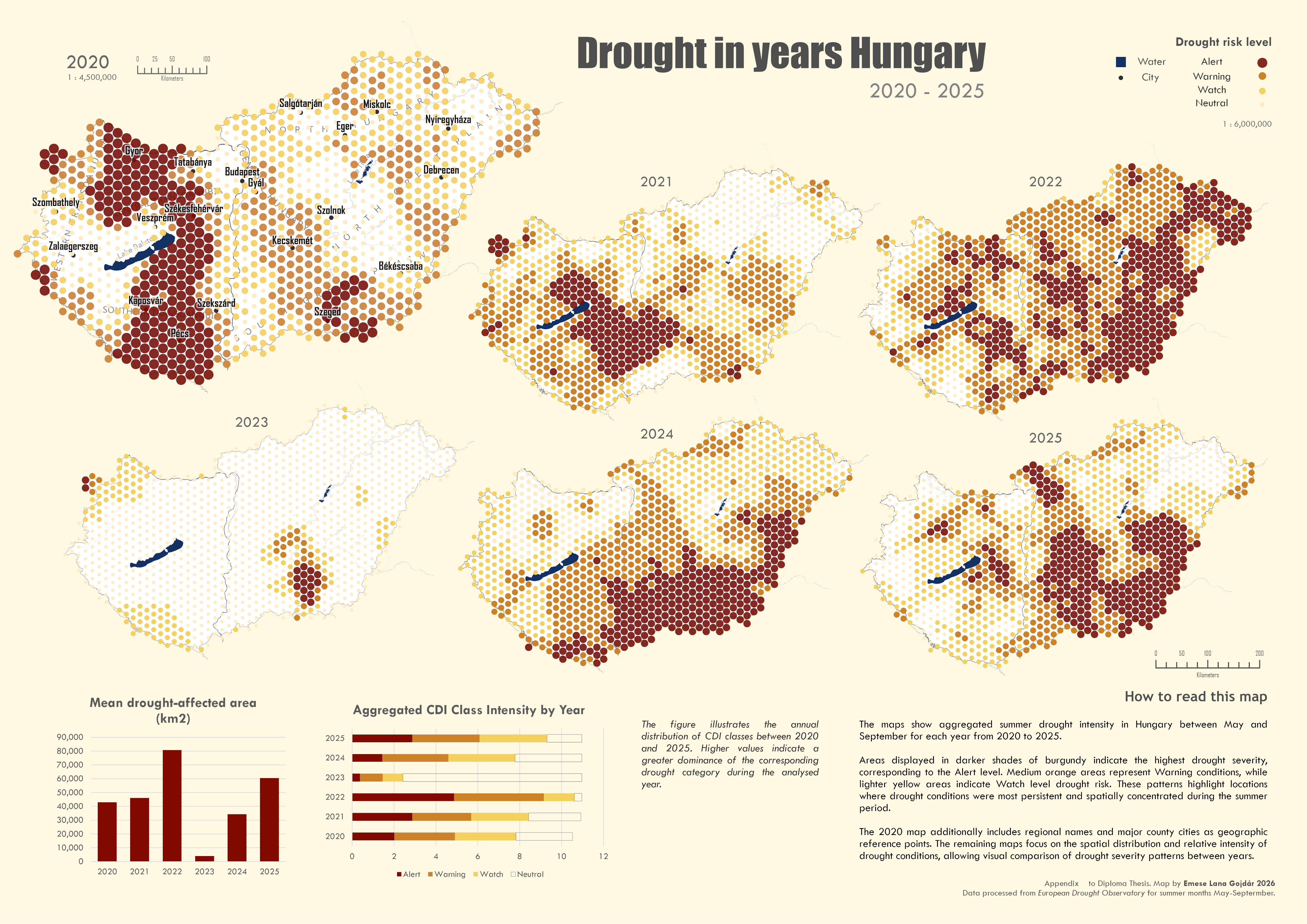
Drought intensity map calculated from aggregated summer seasonal drought polygons, symbolized by Wurman Dots point intensity, where larger and darker dots represent the areas most densely affected by severe (Alert) drought in each year from 2020 to 2025, considering summer periods from May to September.
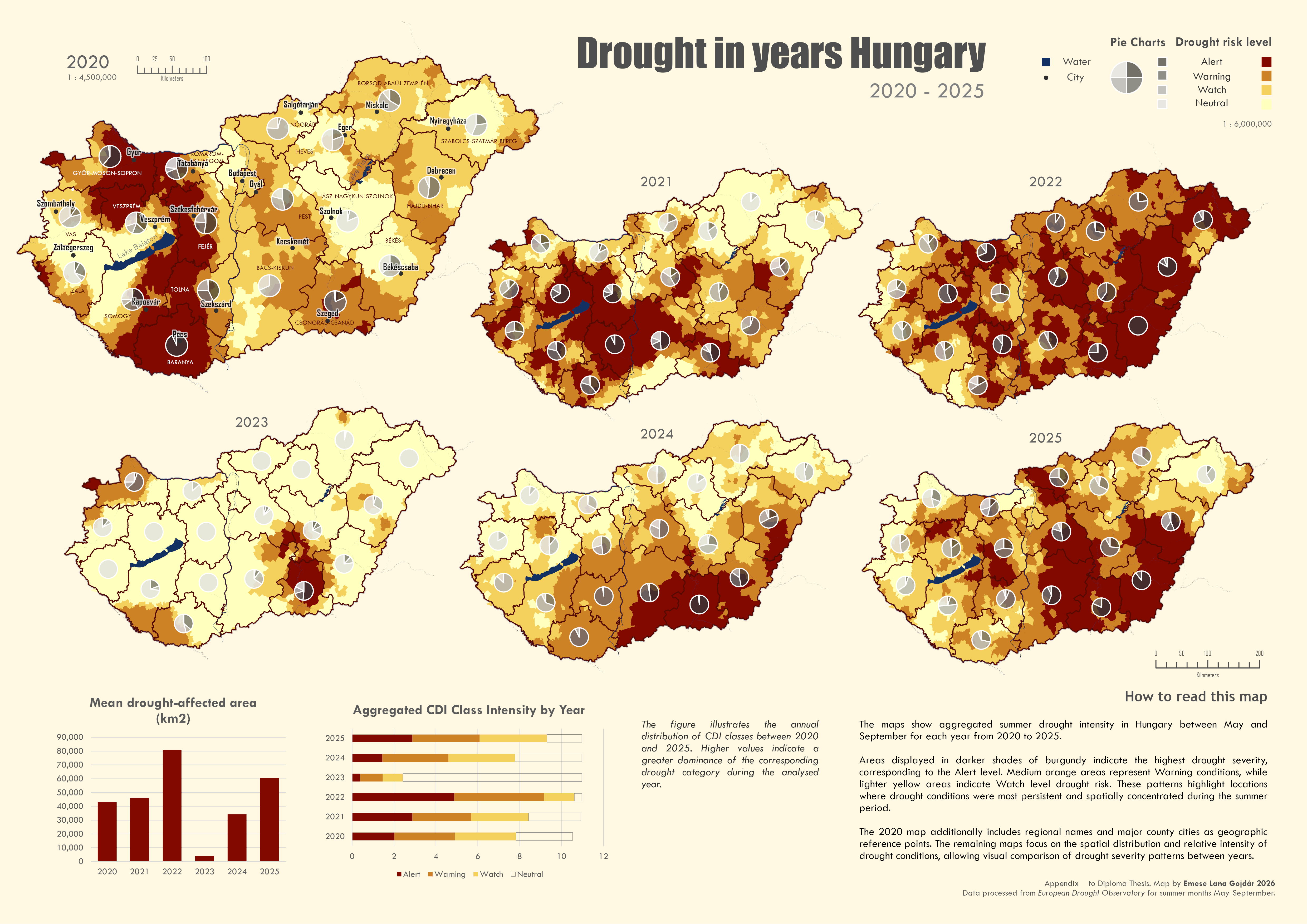
Statistical Map
Drought intensity map calculated from aggregated summer seasonal drought polygons, displayed with Choropleth symbolization at the city administrative level and pie chart meanning mean drought values at the county level. Darker areas represent the areas most heavily affected by severe (Alert) drought, each year from 2020 to 2025, considering the summer periods from May to September.
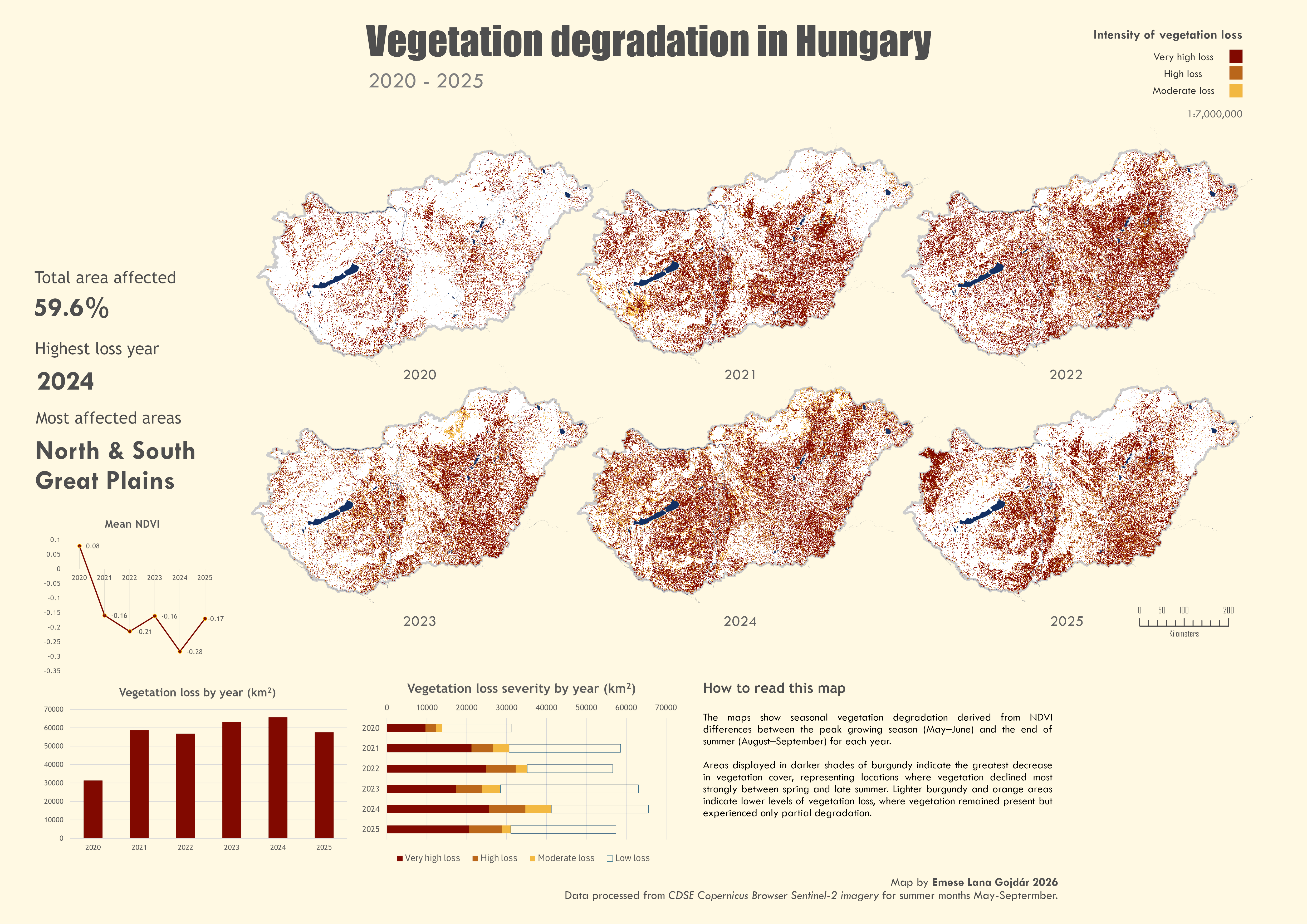
Vegetation degradation in Hungary
Vegetation change (loss) mapping for the given years 2020-2025. In the given years, only the summer seasons from May to September are considered. The pixel classification shows the extent to which the vegetation was damaged by the end of the summer from the areas covered by darker pixels.
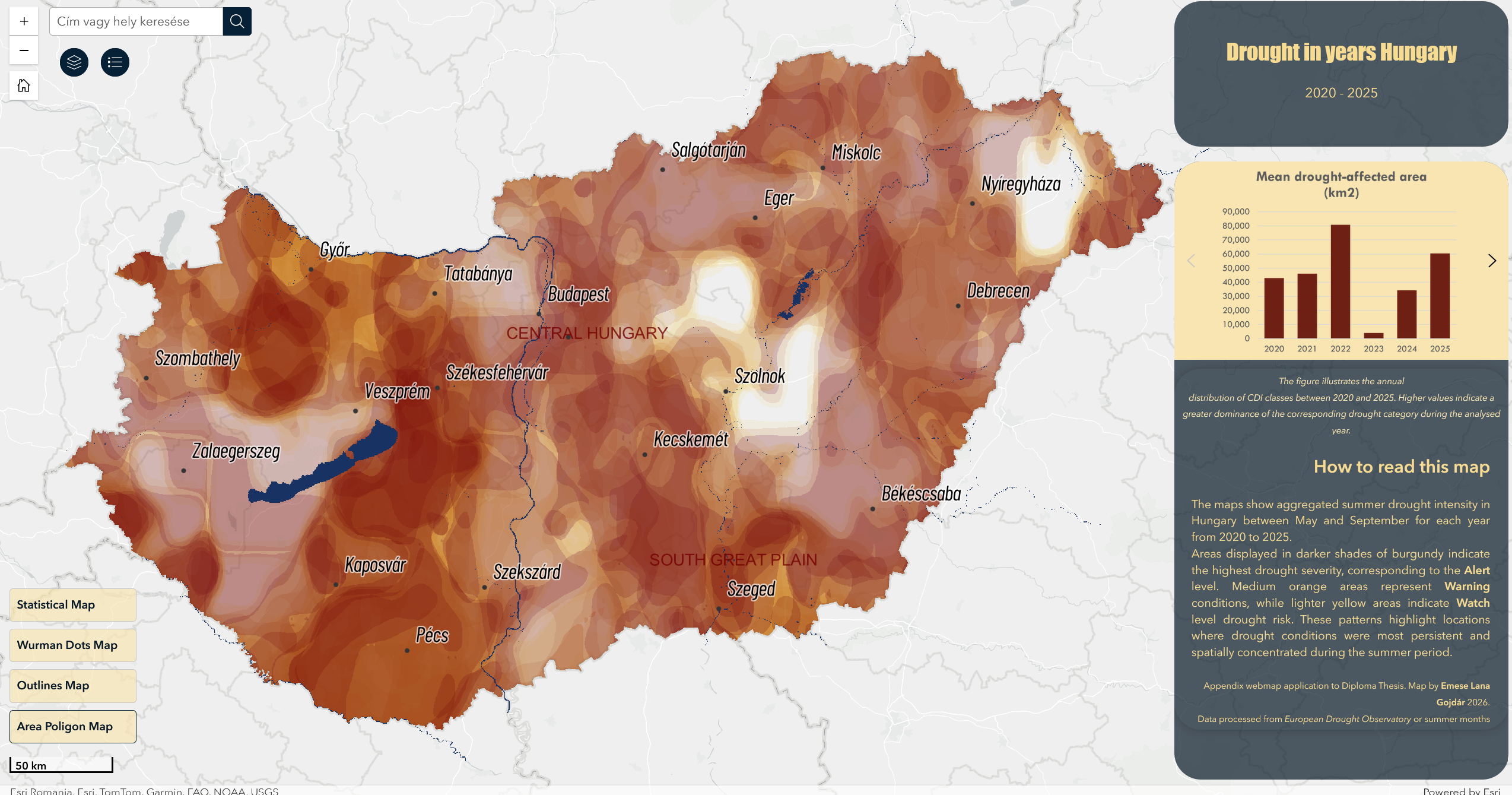
Interactive web map for exploring drought visualizations. Layers can be toggled and changes between years can be selected within map categories.
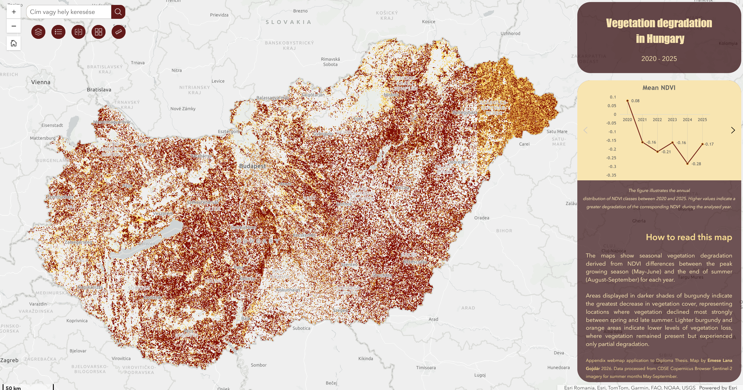
Interactive map to display vegetation degradation, annual layers can be switched and the Swipe tool makes it easy to see the differences in damage from later years compared to the 2020 maps.
Thesis Poster
Overview of the diploma thesis, the applied Copernicus datasets,
the examined drought periods and the selected geovisualization methods.
Diploma Thesis
The complete diploma thesis is available as a PDF document.
It contains the full methodology, data processing workflow,
cartographic design process, user evaluation and conclusions.
About
Drought has become one of the most pressing environmental challenges in Hungary, driven by rising temperatures, irregular precipitation patterns, and increasingly frequent heatwaves.
These changes affect agriculture, forests, water resources, and natural ecosystems across the country. While Earth Observation data provide valuable insights into drought impacts and vegetation change, their complexity often limits accessibility for non-expert audiences.
This project explores how different geovisualization methods can communicate environmental changes more effectively by transforming Copernicus satellite data into clear, informative, and interactive maps.
Research Objectives
The main objective of this thesis is to evaluate which geovisualization method most effectively communicates the severity of drought in Hungary to a non-expert audience. By comparing several static cartographic representations alongside interactive web maps and supplementing the analysis with a vegetation degradation map derived from Copernicus data, the study investigates how different visualization techniques influence the interpretation and understanding of environmental change. The research aims to identify the most suitable approach for presenting complex drought-related information in a clear, intuitive, and accessible way.
Methods and Data
The drought analyses presented in this project are based on raster datasets provided by the European Drought Observatory (EDO) within the Copernicus Emergency Management Service (CEMS). The visualizations were generated from the Combined Drought Index (CDI), which integrates information on precipitation deficit, soil moisture, and vegetation greenness to provide a comprehensive assessment of drought conditions.
Data preprocessing and spatial analyses were automated using ArcPy notebooks and ArcGIS ModelBuilder workflows, ensuring a reproducible methodology. The complete processing workflow is planned to be published as open-source Jupyter Notebooks on GitHub, allowing other users to reproduce the analysis for their own countries using the publicly available EDO datasets.
To complement the drought maps, vegetation degradation was analysed using the Normalized Difference Vegetation Index (NDVI). The NDVI maps were calculated from Sentinel-2 satellite imagery downloaded through the Copernicus Data Space Ecosystem (CDSE) Browser. National mosaics were created before calculating vegetation changes for the selected study periods.
All maps examine identical time intervals, focusing on the most severe drought periods in Hungary between May and September, corresponding to the main growing season. As climate change continues to alter seasonal patterns, future versions of the workflow may extend the analysis to longer time periods and include animated temporal change maps generated directly from the processed datasets.
Following data processing, the cartographic design and geovisualizations were developed and evaluated through user testing. The assessment primarily involved GIS and cartography experts, who identified the strengths and limitations of each visualization method, while additional feedback from non-expert users provided insight into the effectiveness of communicating drought impacts to a broader audience. The combined evaluation forms the basis of the conclusions presented in this thesis.
Main Findings
The user evaluation demonstrated that no single geovisualization method was universally superior. Instead, the effectiveness of each map depended on the purpose of use, the spatial scale, and the users' previous experience with cartographic products. Statistical maps proved to be the most accessible for non-experts due to their familiar administrative boundaries and clear visual hierarchy, while the Wurman Dots and Area Polygon maps were preferred by GIS professionals for presenting spatial drought patterns without administrative constraints. The experimental Outlines Map attracted attention because of its unique appearance, although it was considered more difficult to interpret without additional context.
The comparison between printed and interactive maps also revealed that the two approaches should not be considered competitors but complementary visualization tools. Static layouts allowed rapid comparison of multiple years at a national scale, whereas the interactive web applications enabled users to explore individual locations in greater detail through zooming, layer switching and additional map functions. The inclusion of NDVI vegetation degradation maps further encouraged users to recognize that vegetation response does not always directly correspond to drought intensity, highlighting the complexity of environmental processes.
Conclusion
This thesis demonstrates that carefully designed geovisualizations can make complex Copernicus Earth Observation data significantly more understandable for both experts and the general public. Rather than relying on a single visualization technique, the study shows that combining different cartographic approaches provides the most effective communication of drought impacts, allowing users to explore environmental changes from both national and local perspectives. The accompanying web maps further extend the value of the static maps by offering an interactive environment for exploration and learning.
Beyond the cartographic products themselves, the project establishes a reproducible workflow for processing Copernicus Emergency Management Service drought data and Sentinel-2 imagery using automated GIS tools. The methodology can be adapted for other countries using openly available datasets, supporting future research, environmental education and decision-making. The results suggest that accessible, visually engaging geovisualizations have considerable potential to improve public understanding of drought and climate change while providing a practical foundation for future developments in web-based environmental communication.
