Diploma Thesis
Geovisual Storytelling of Climate-Induced Migration Patterns in Urban Environments
A dual-pace geovisual storytelling platform comparing slow-onset drought migration across Europe (2015 to 2024) with rapid-onset displacement in Southern Malawi following Tropical Cyclone Freddy (2023).
Objectives
“The objective of this thesis is to design a set of maps and non-spatial data visualisations forming a storytelling platform presenting migration trends driven by climate stressors. The student will investigate available data sources, with particular attention to those provided by programmes such as COPERNICUS.” Source: Assignment of Diploma Thesis (PAAV)
This thesis illustrates how geovisual storytelling methods can be designed to communicate the patterns and spatial dynamics of climate-induced human displacement to urban planners and policy makers. Two contrasting case studies are compared: slow-onset migration across urban regions of Europe, driven by cumulative drought stress, and rapid-onset displacement in southern Malawi following Tropical Cyclone Freddy. A multi-technique cartographic map suite is produced using ArcGIS Pro and assembled into this website. The resulting platform is descriptive by design: it visualizes where and how severely climate-related displacement patterns occur, without asserting a causal relationship between climate stress and migration.
Methods and Workflow
Data Sources
- Copernicus Climate Data Store & Land Monitoring Service
- Eurostat & ARDECO
- IOM Displacement Tracking Matrix
- OCHA / Humanitarian Data Exchange
- Sentinel-2 & Planet imagery
Software
- ArcGIS Pro: all cartographic processing and design
- QGIS: data integrity checks
- Google Forms: user-testing questionnaire
- Canva: A2 poster design
Cartographic Techniques
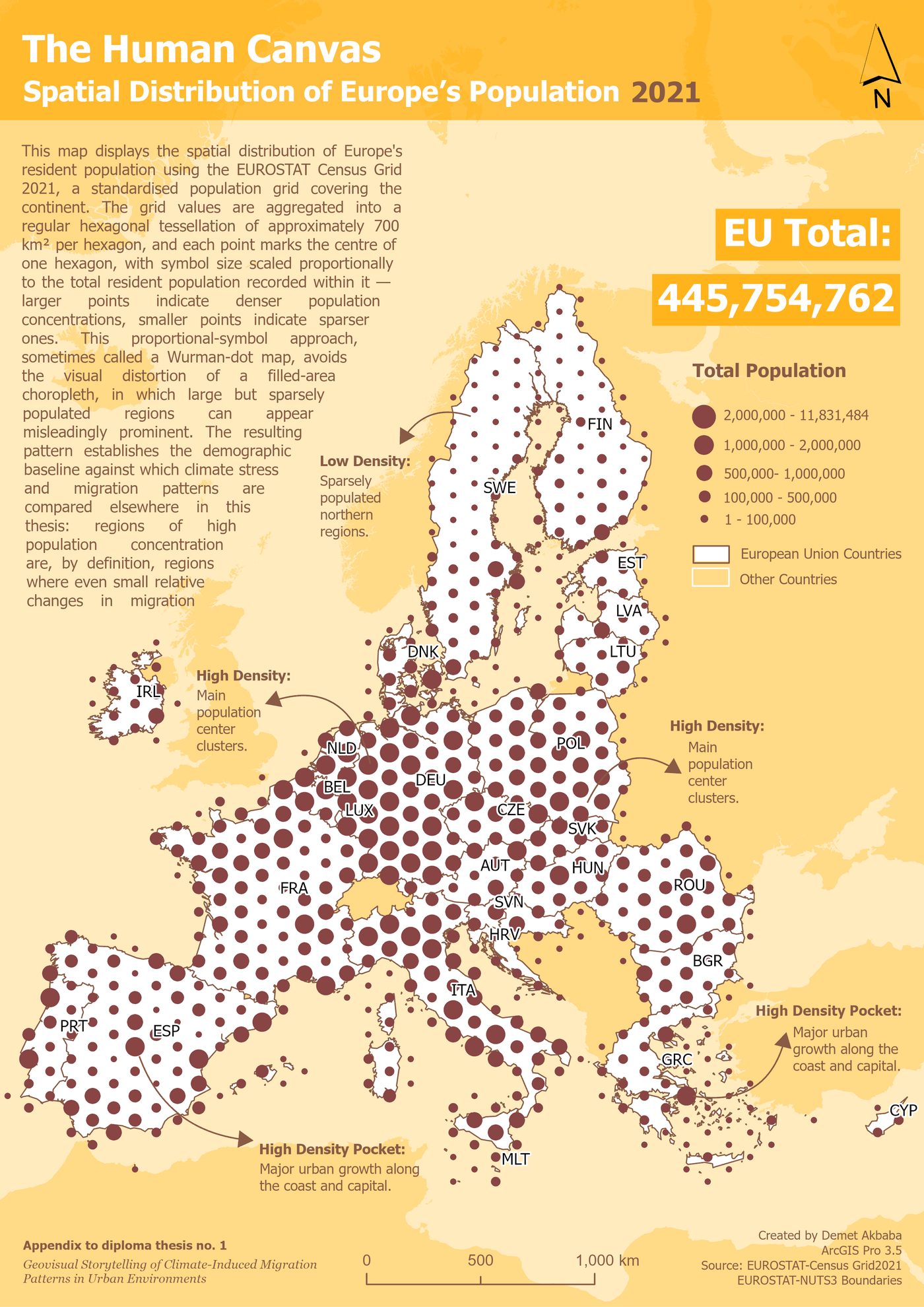
- Graduated symbols (Wurman dots)
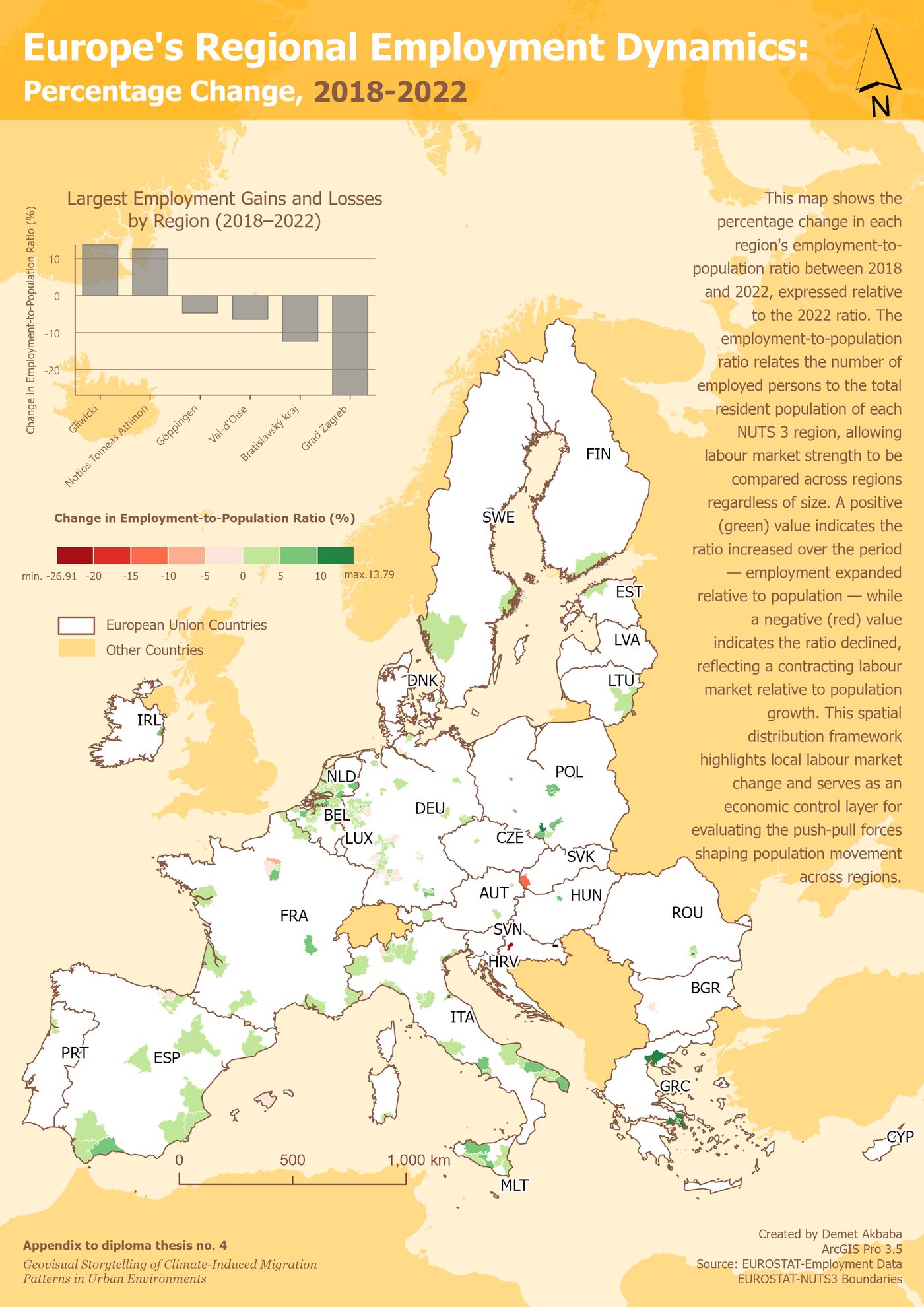
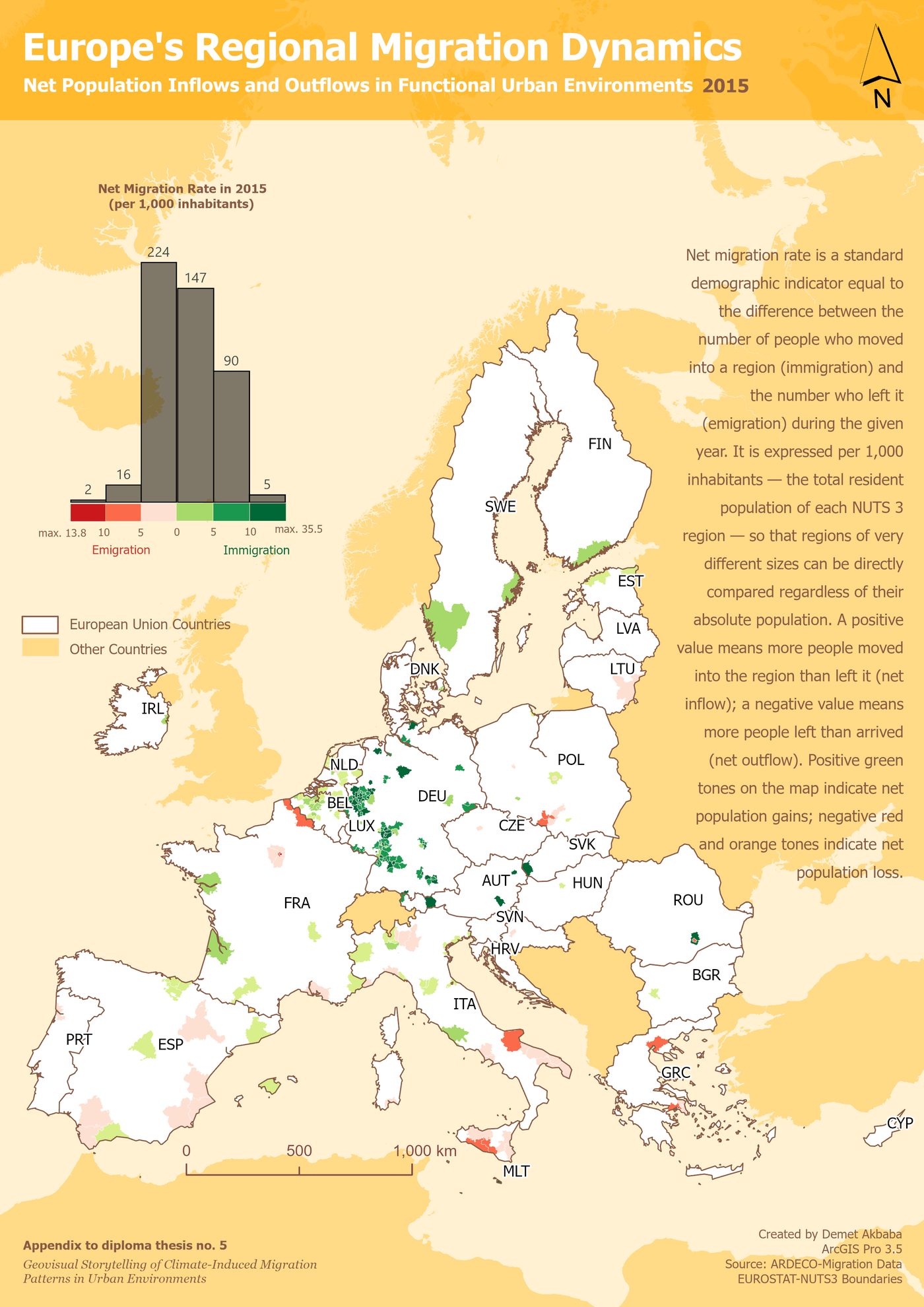
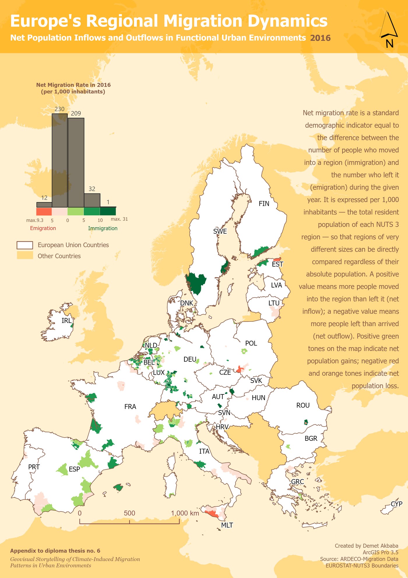
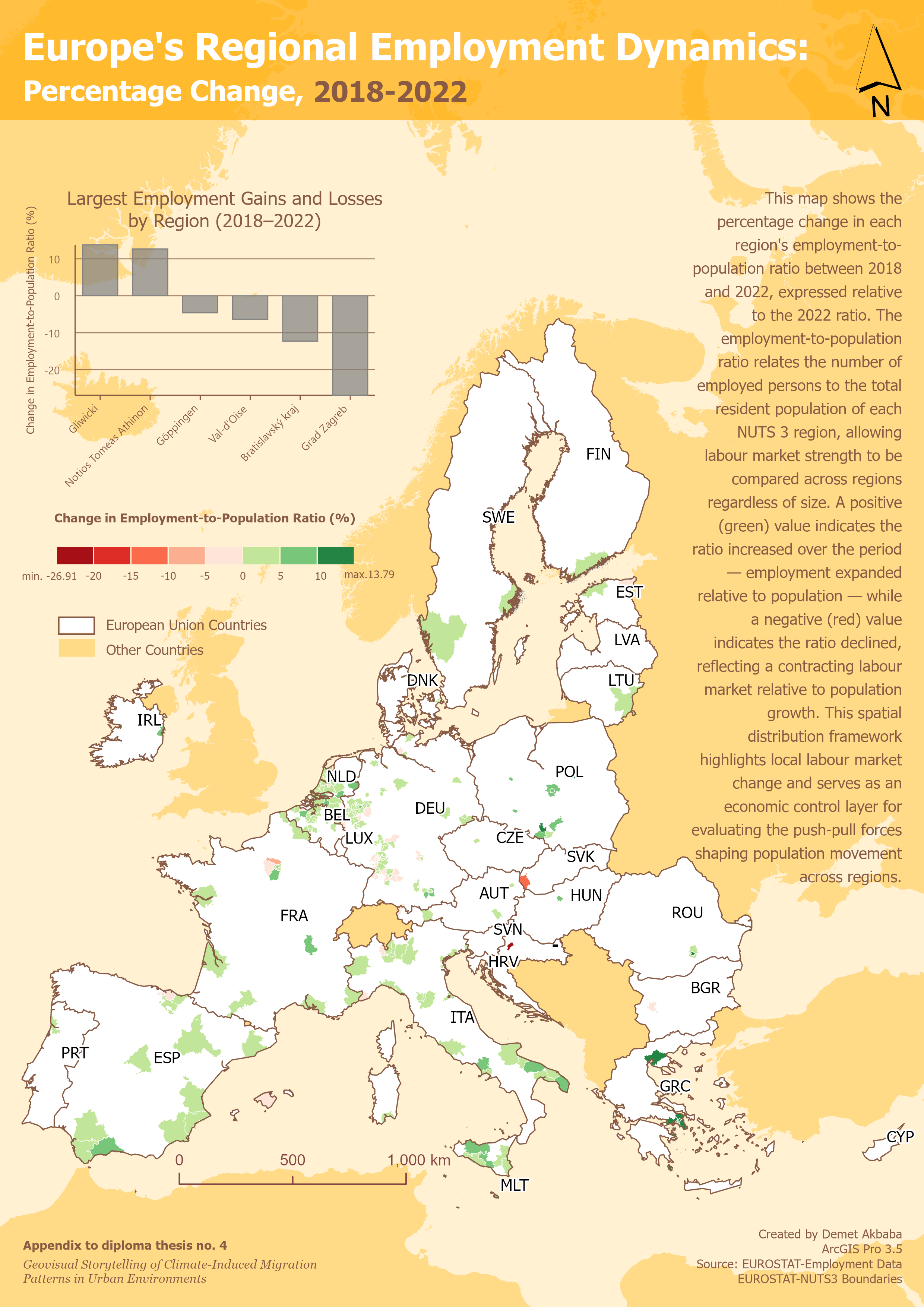
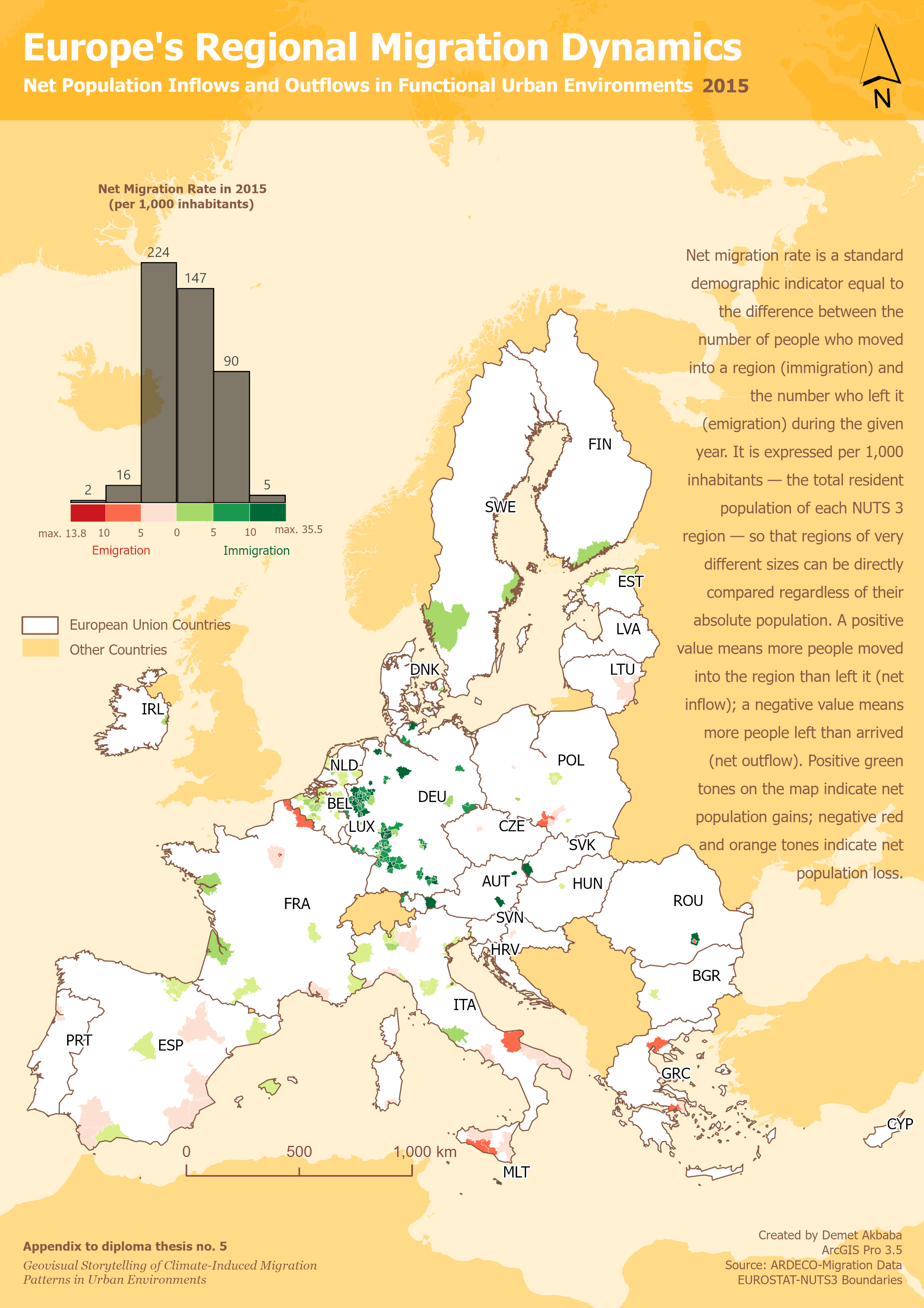
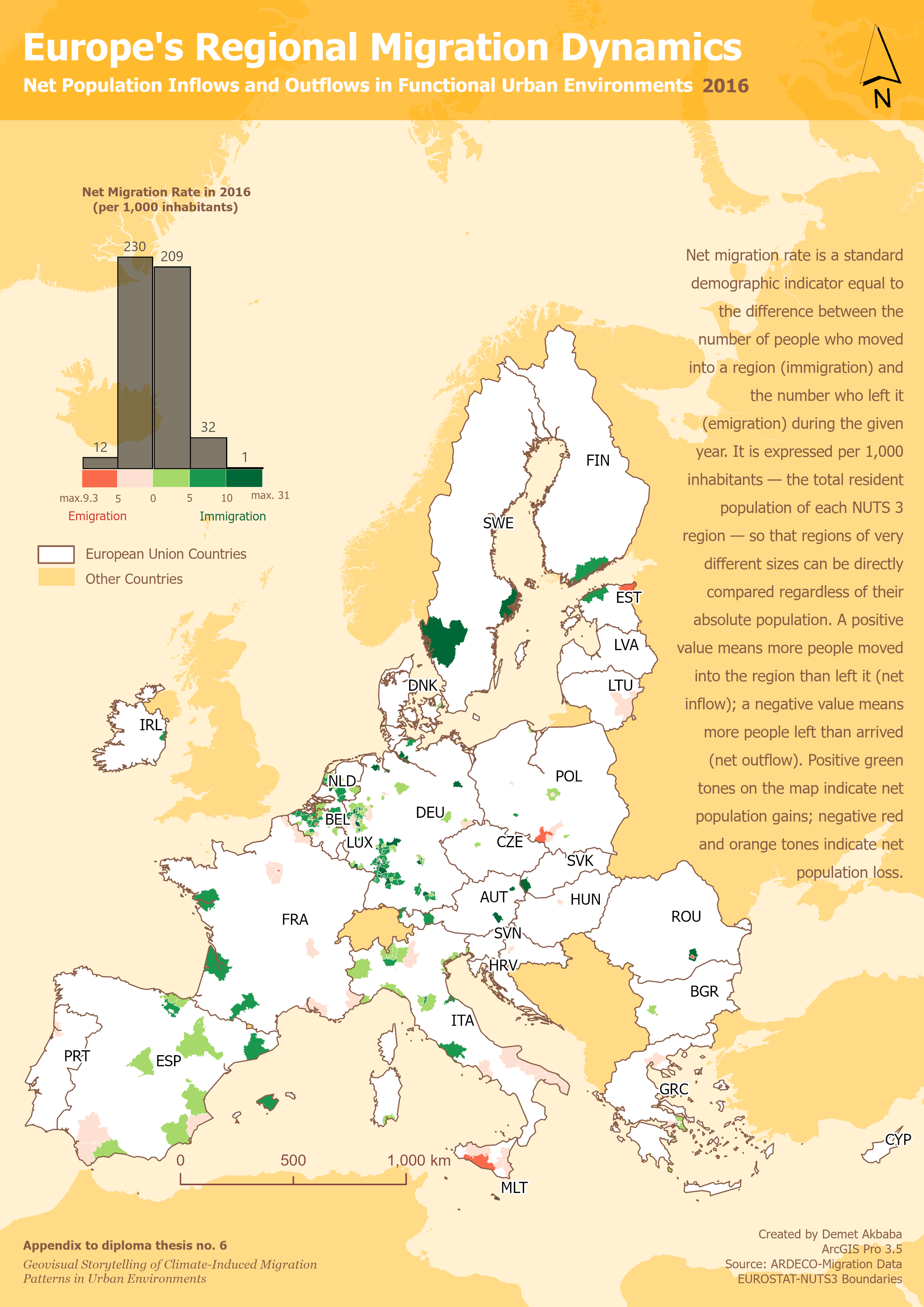
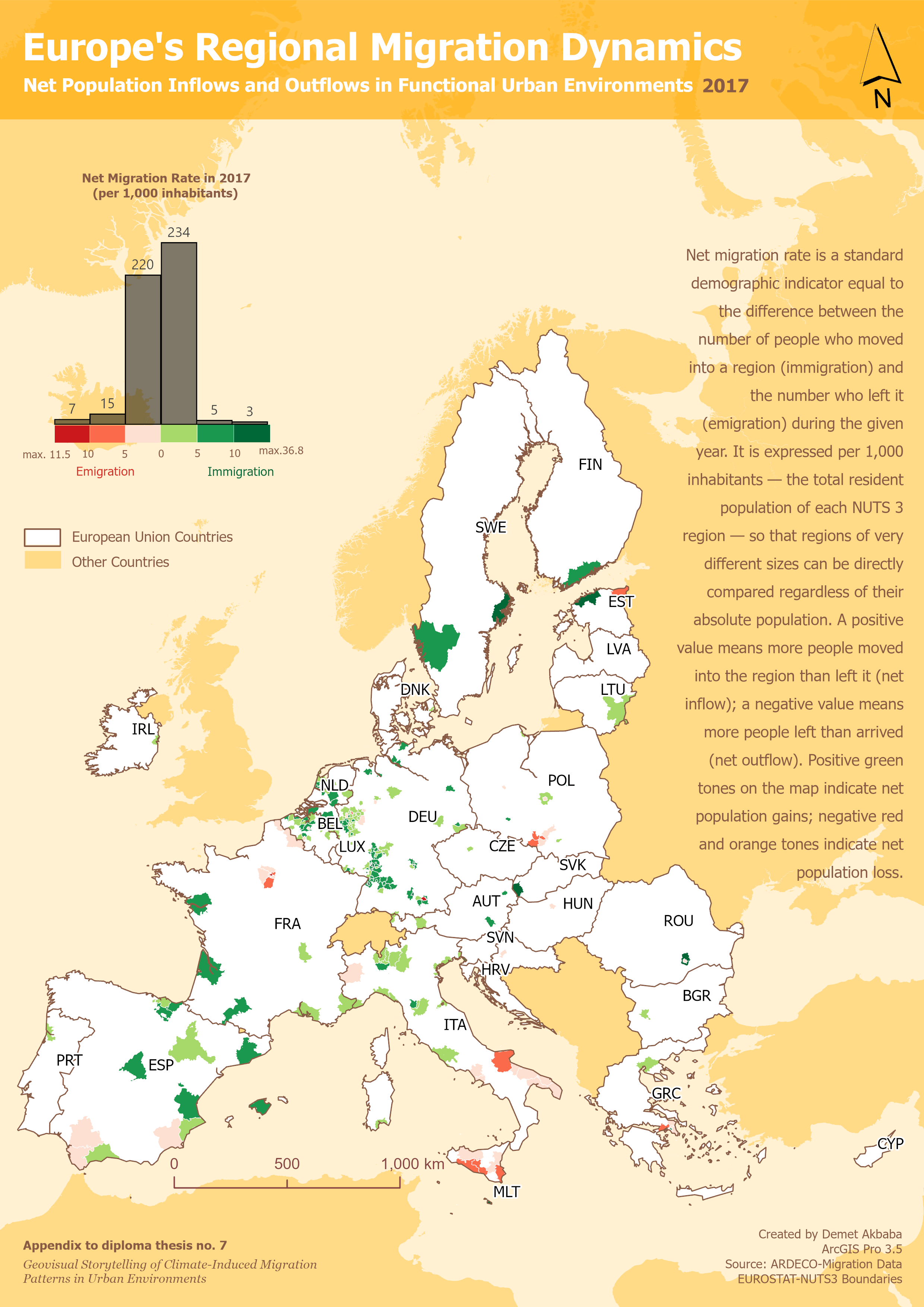
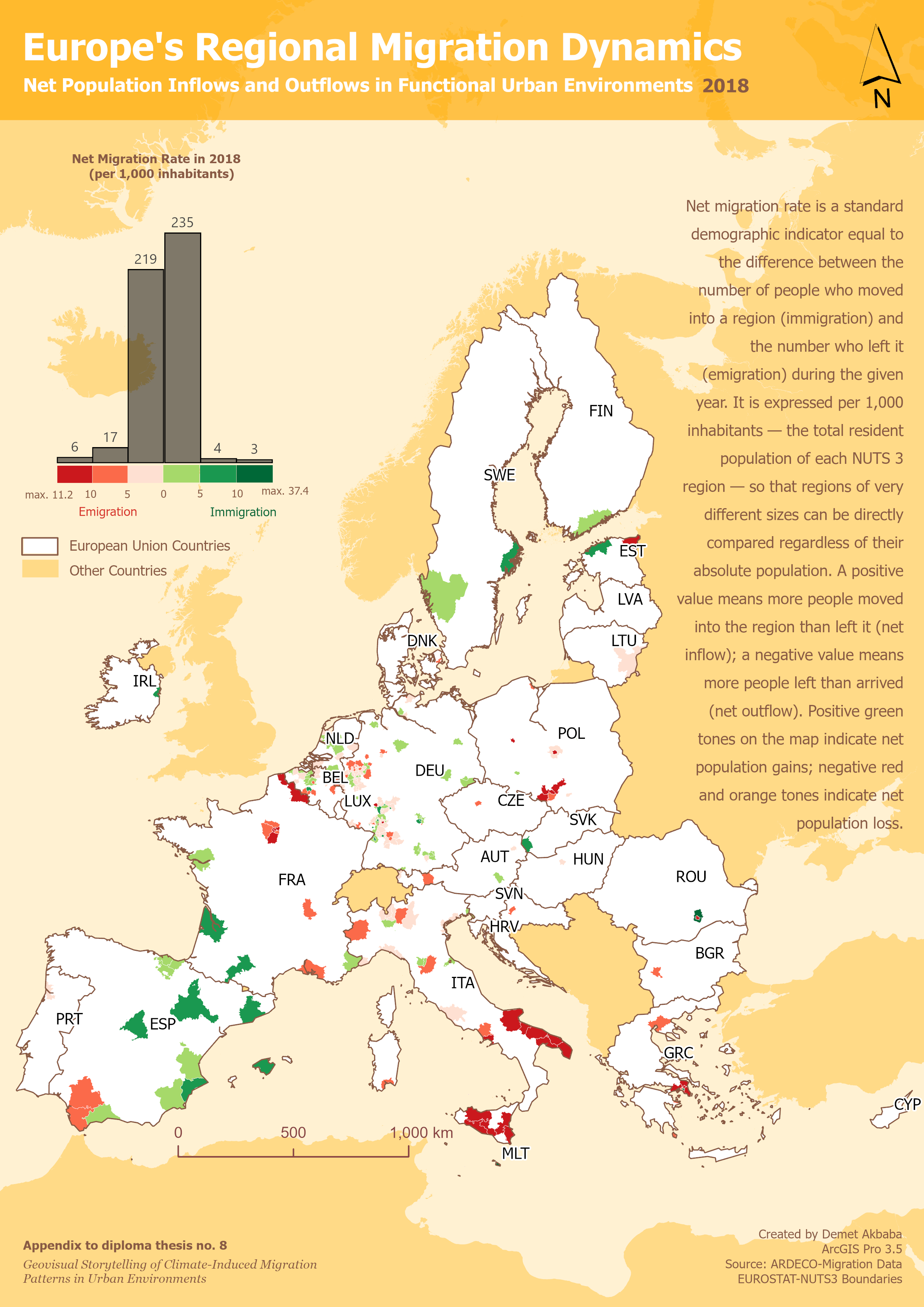
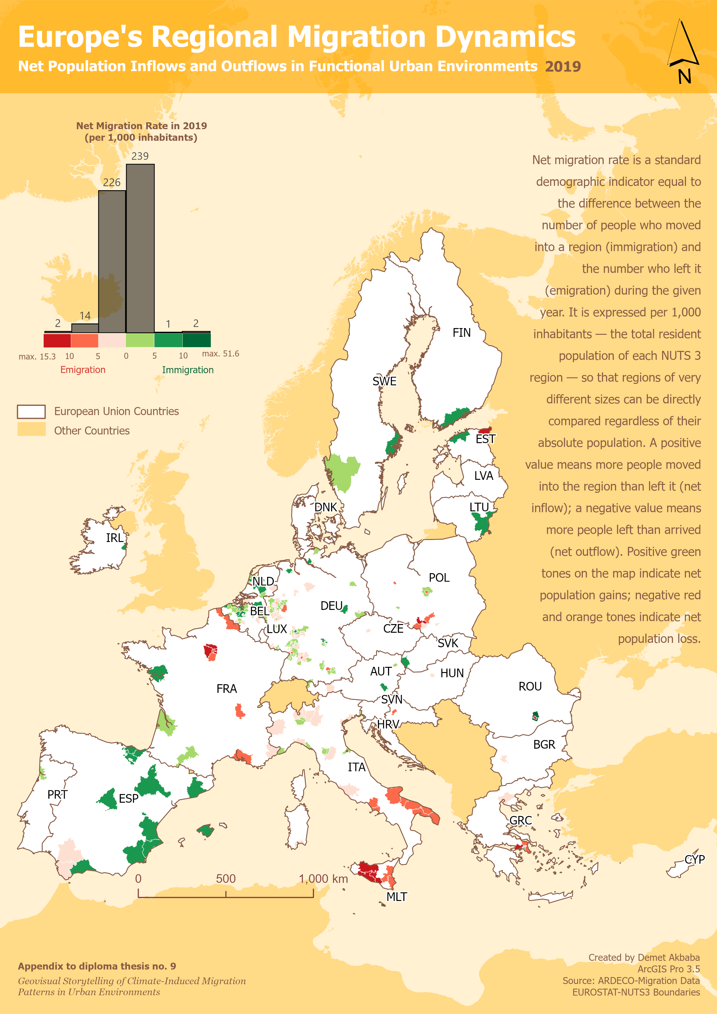
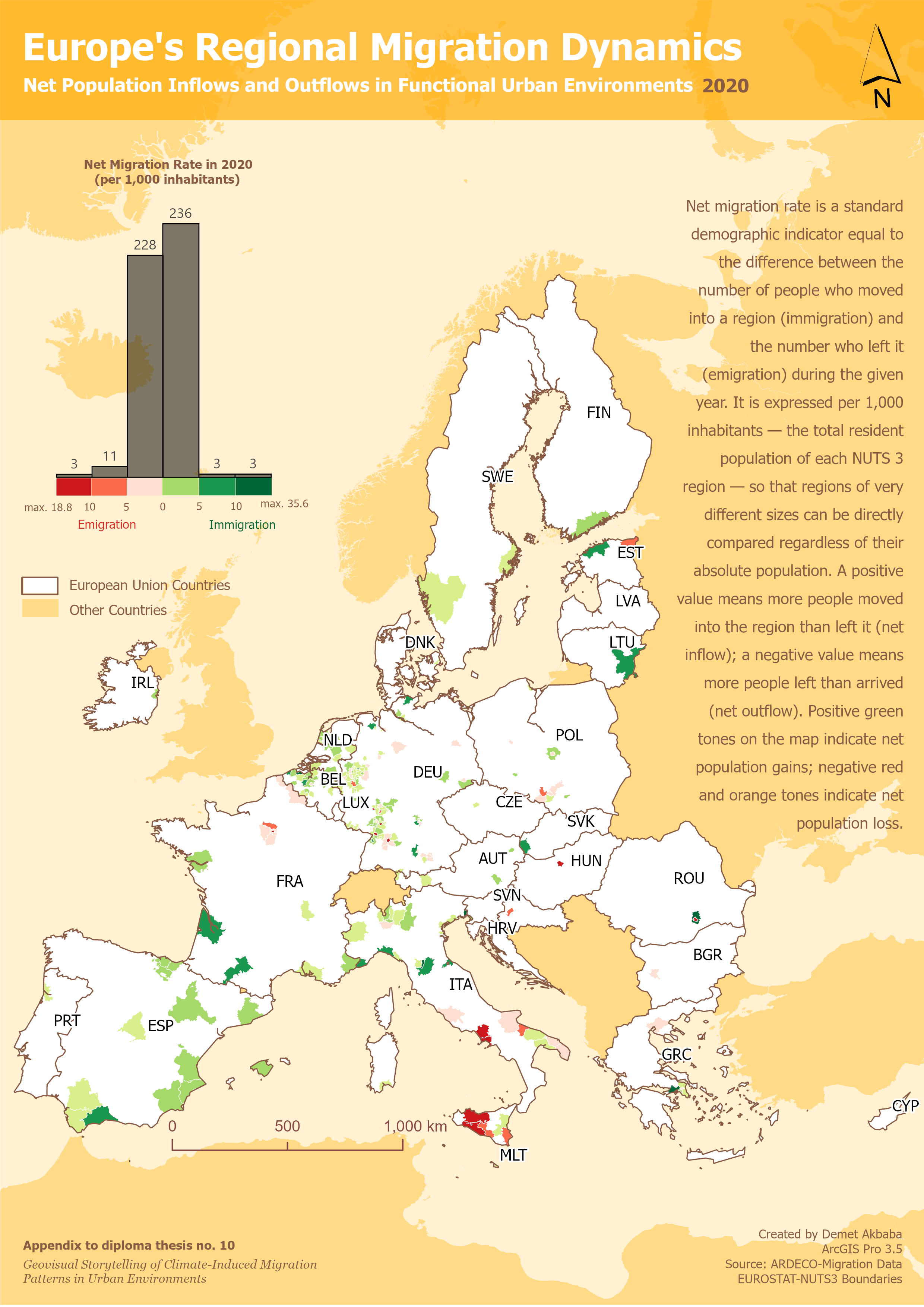
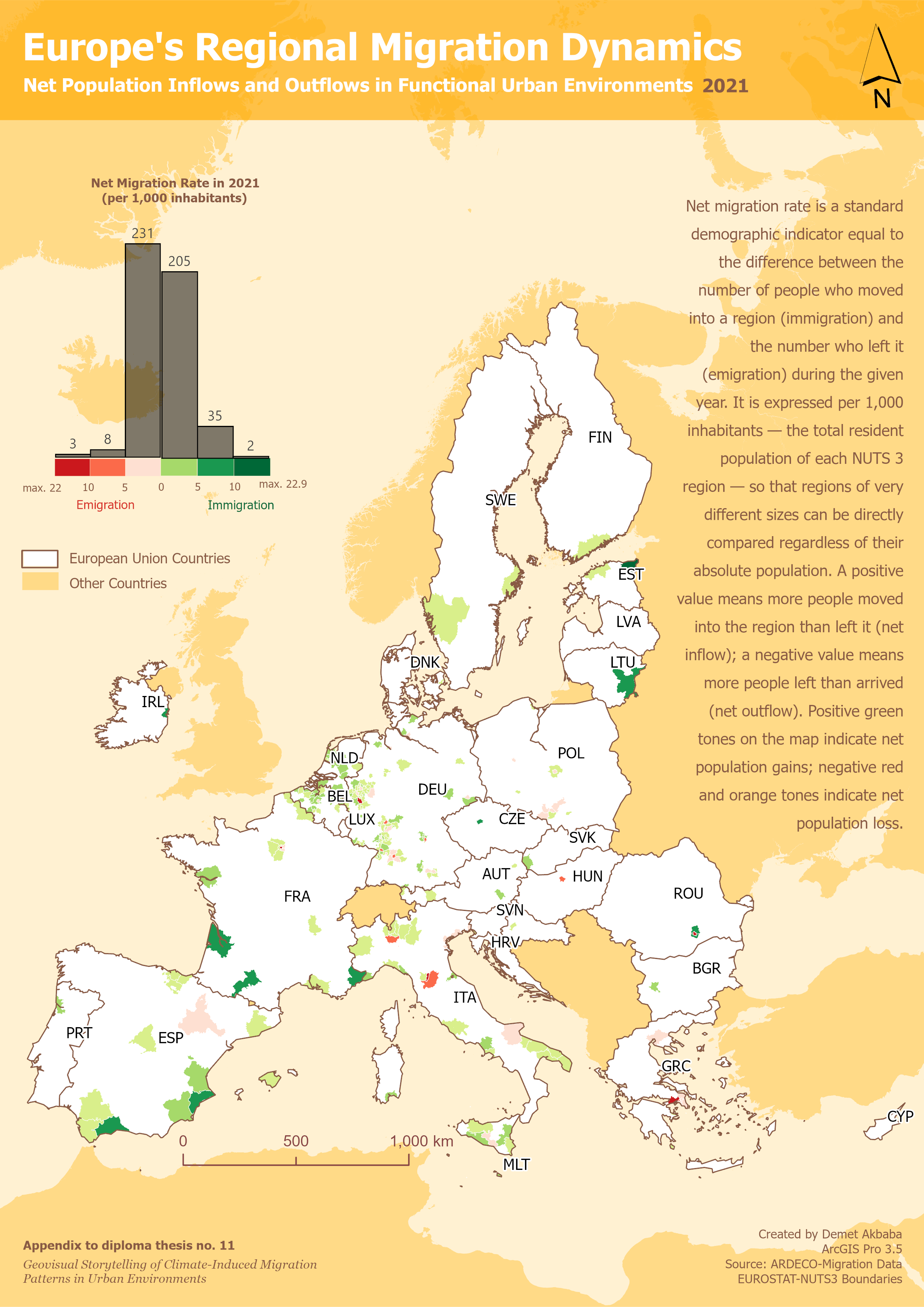
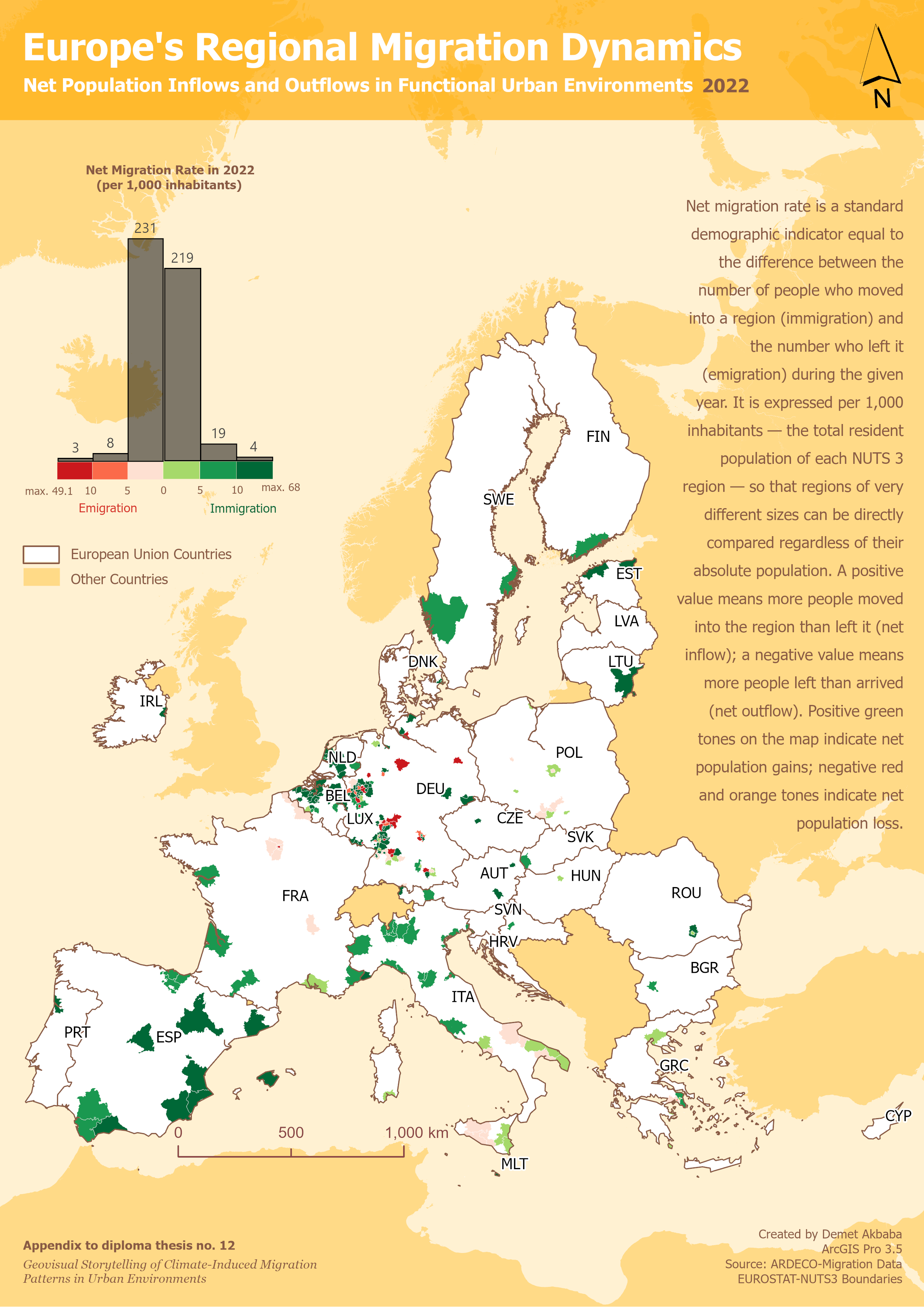
- Choropleth mapping (annual sequence)
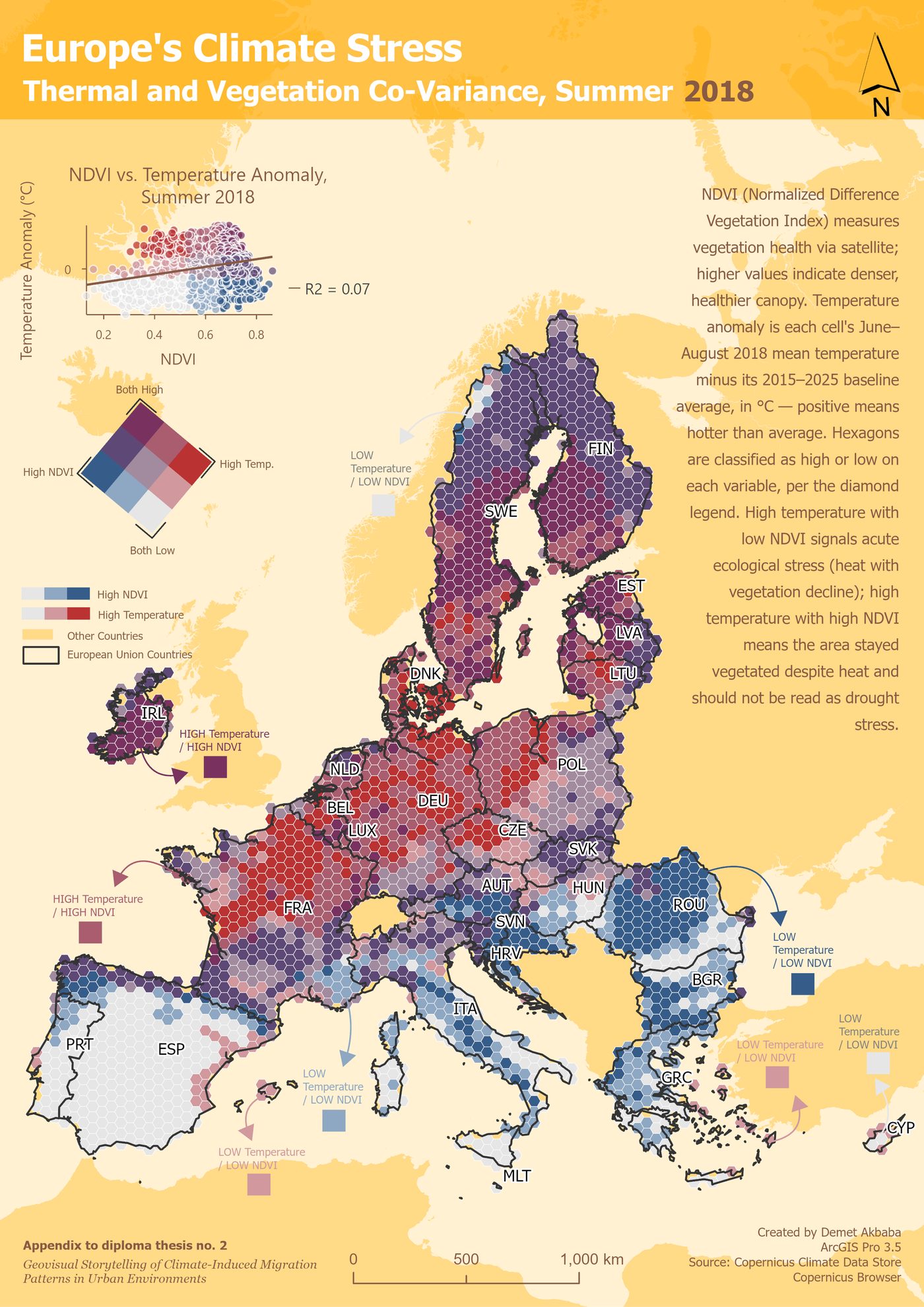
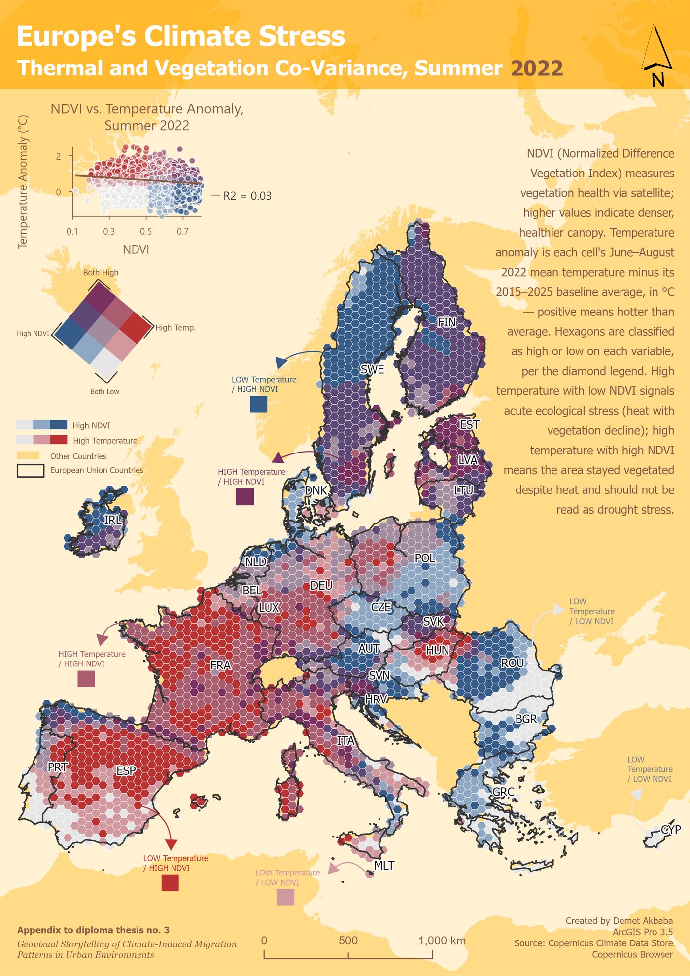
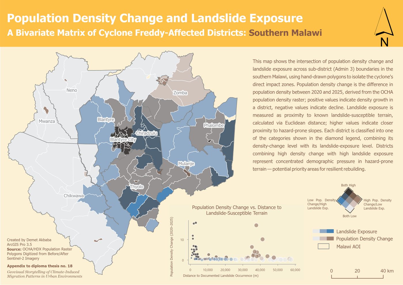
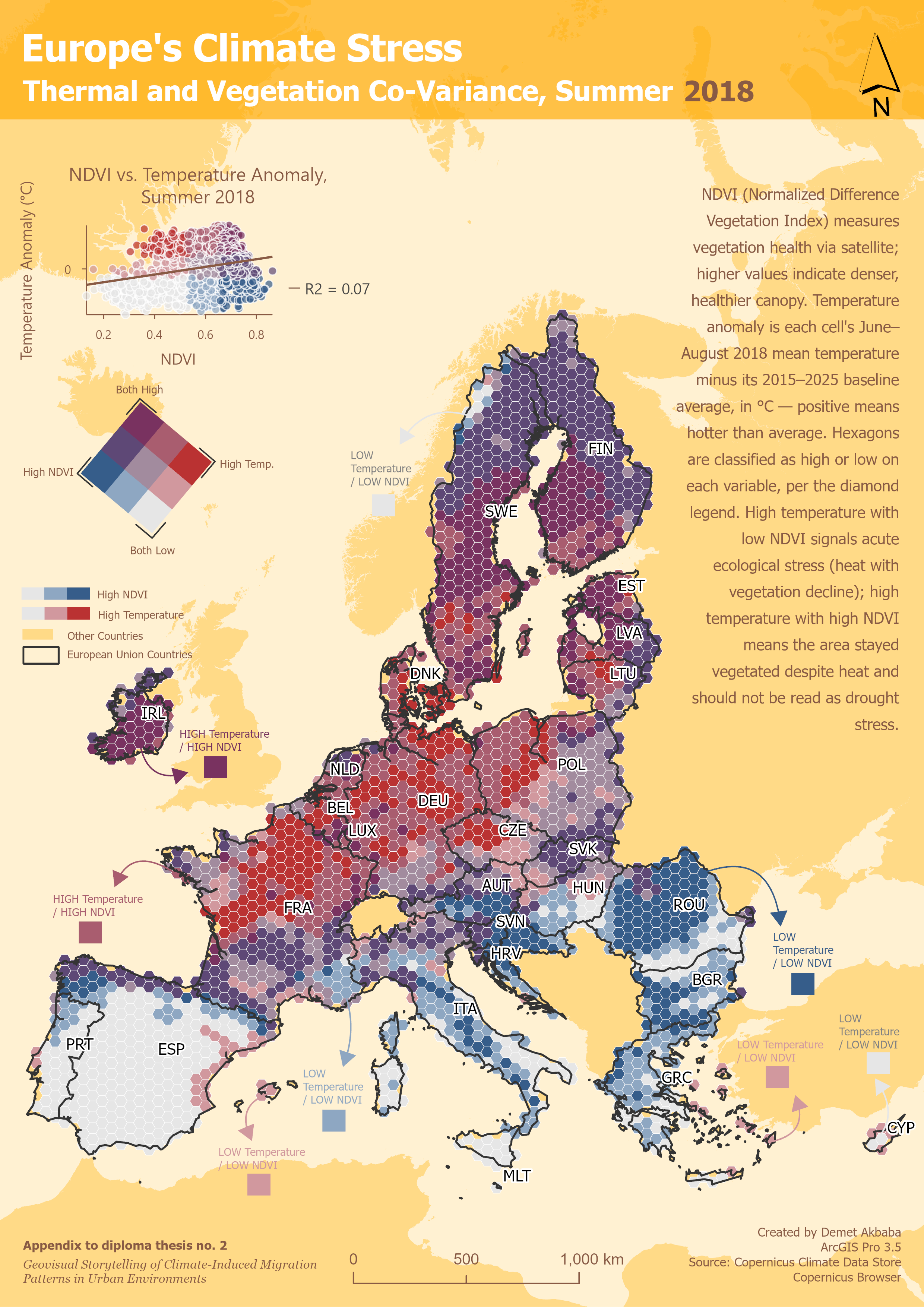
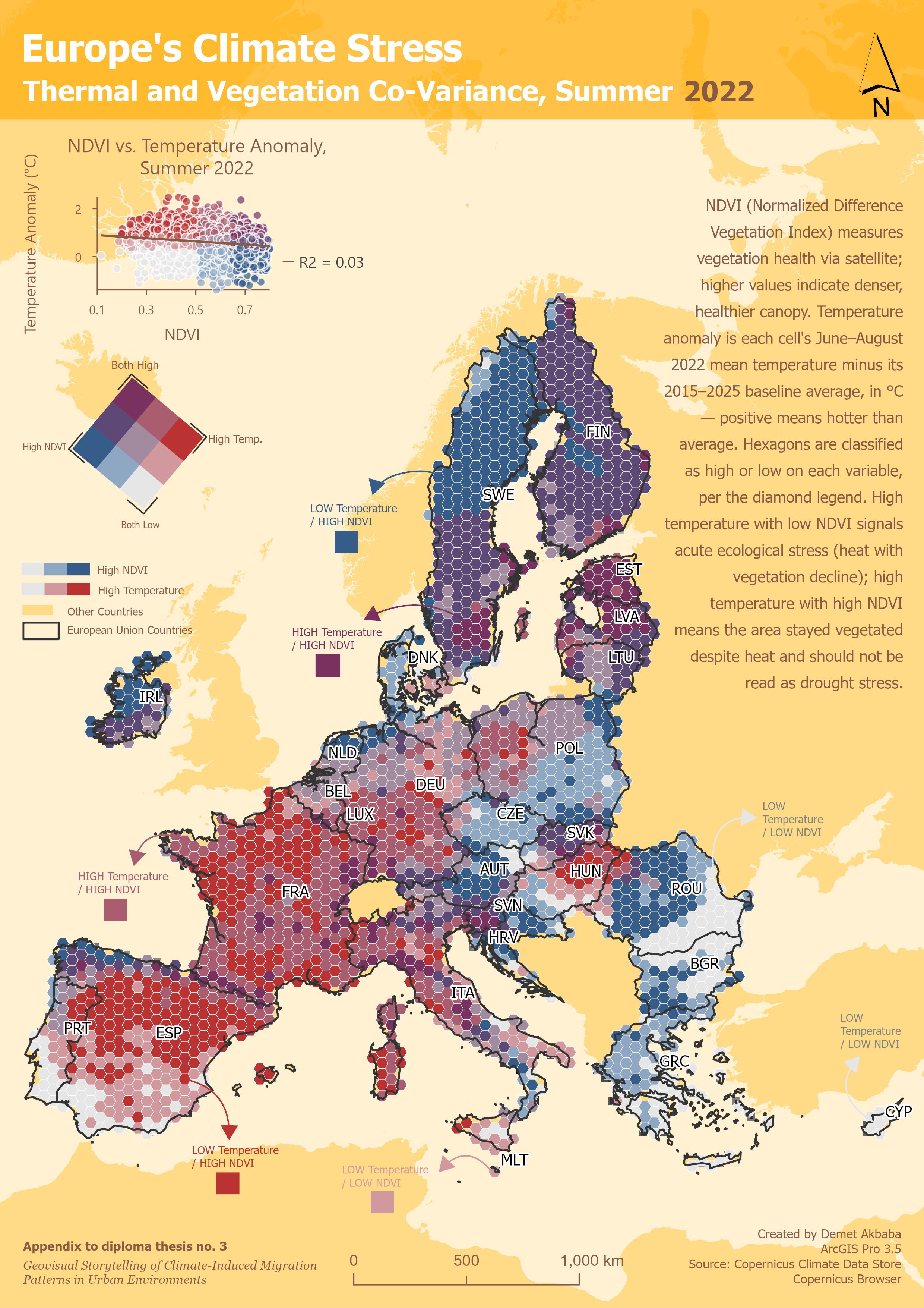
- Bivariate colour matrices
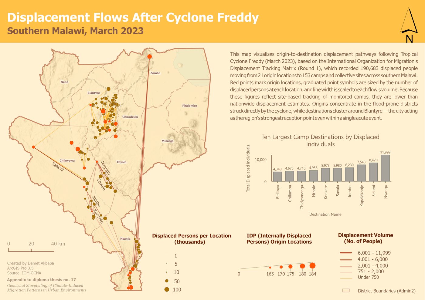
- Origin-destination flow mapping
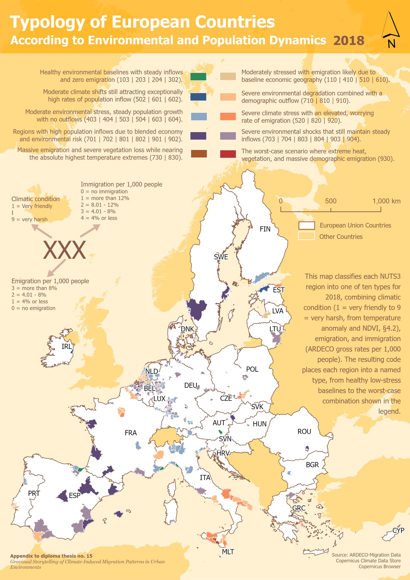
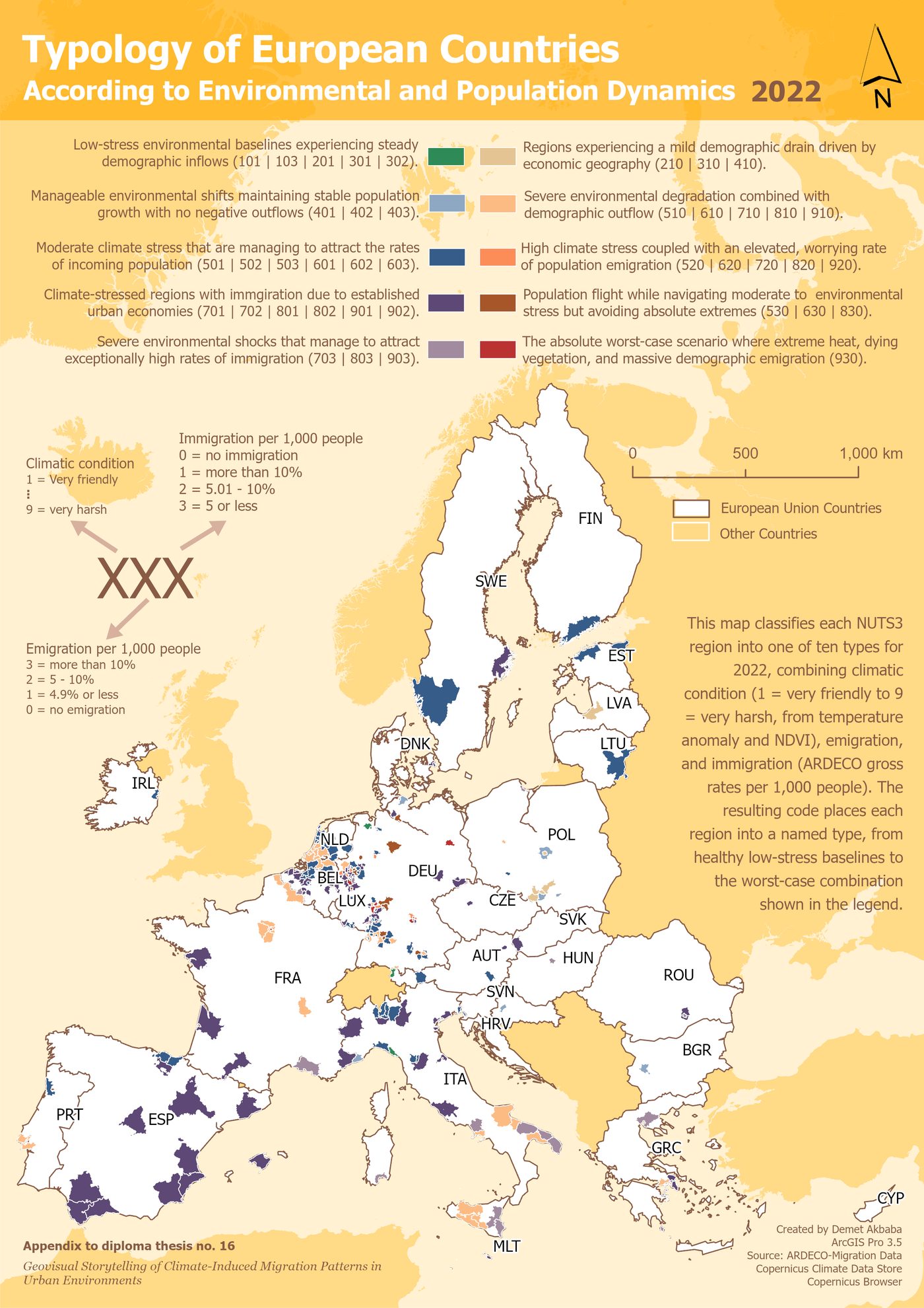
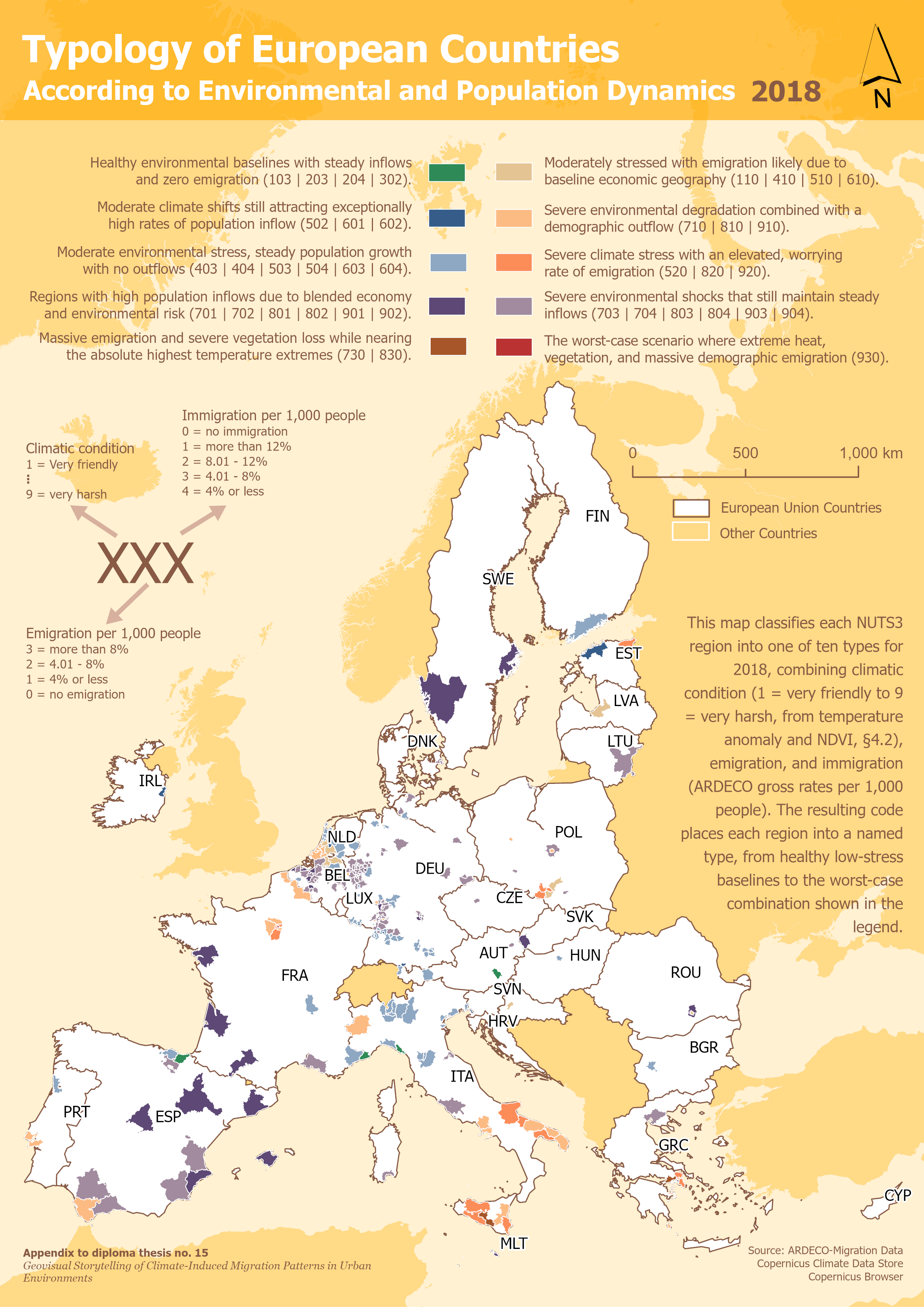
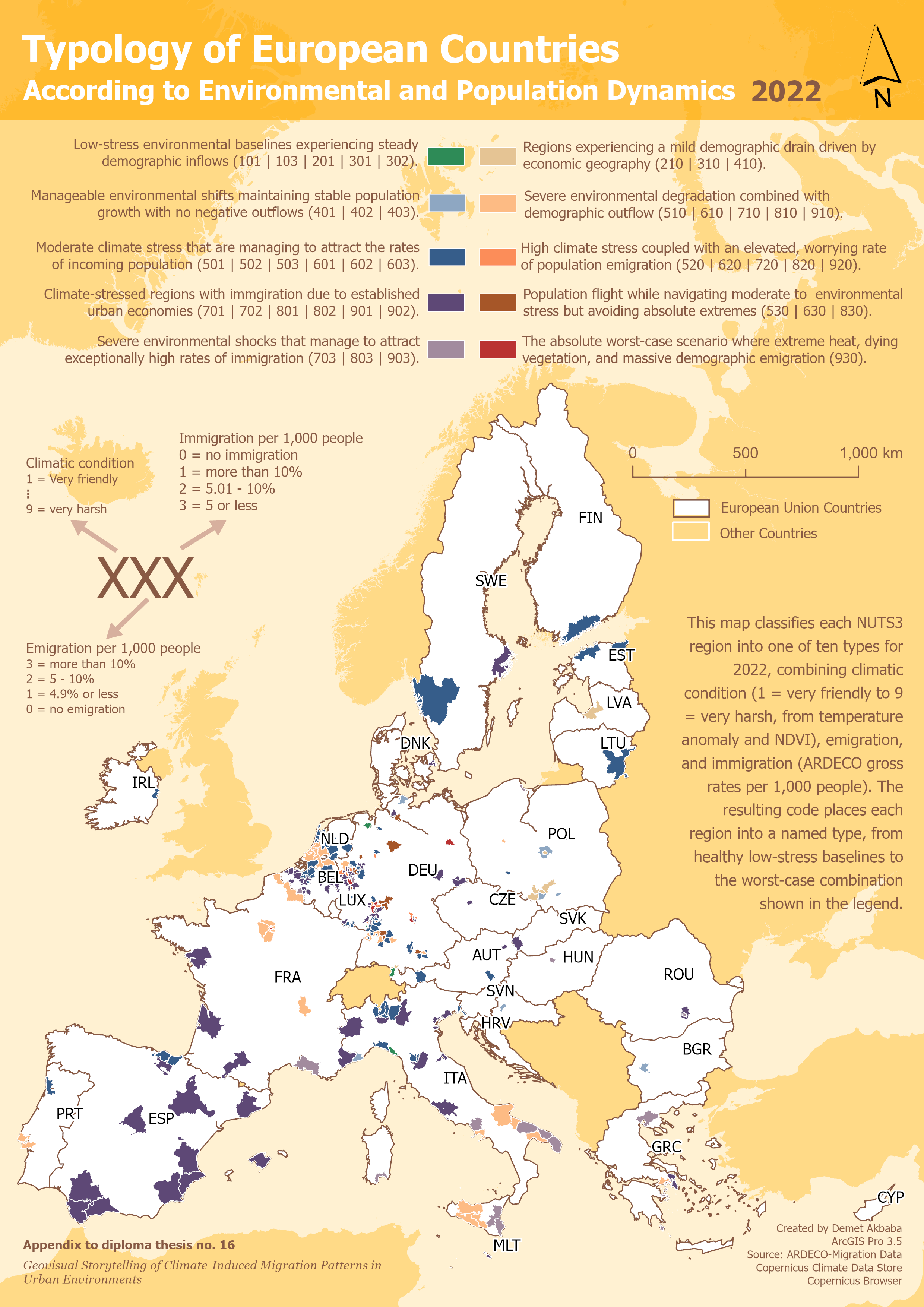
- Rule-based regional typology
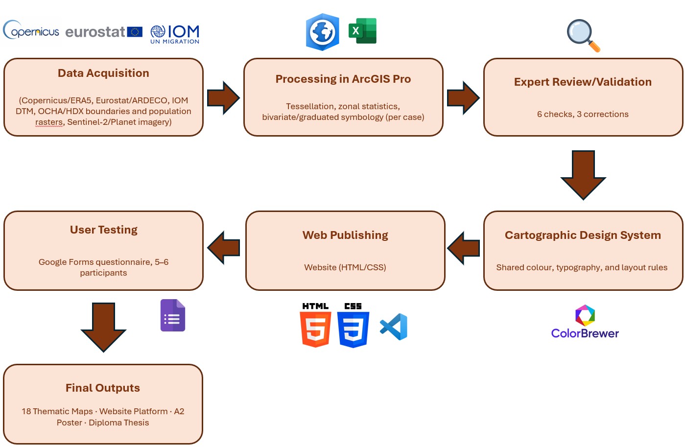
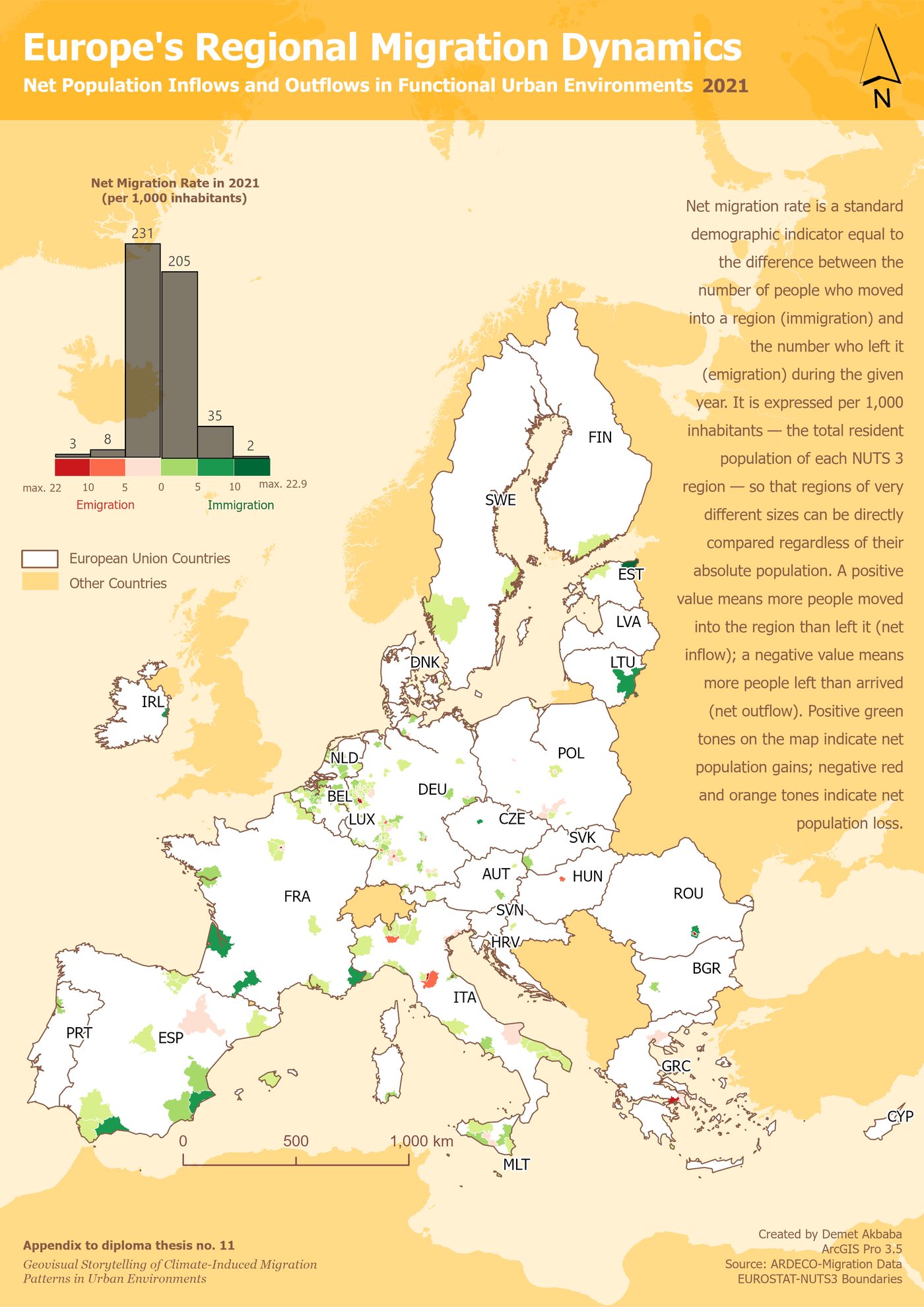
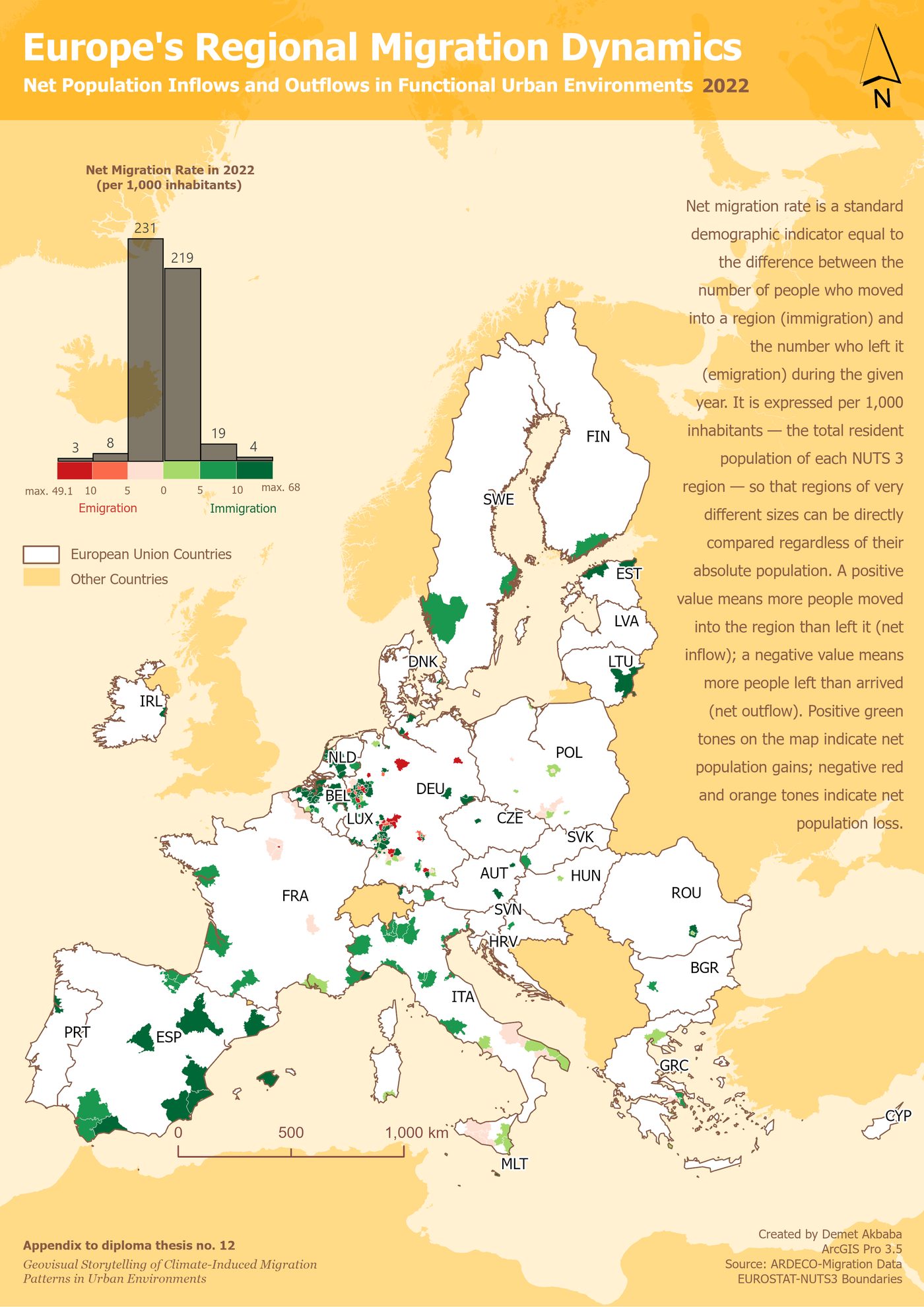
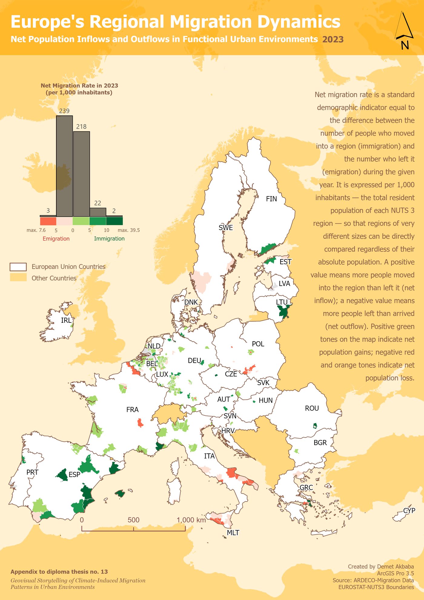
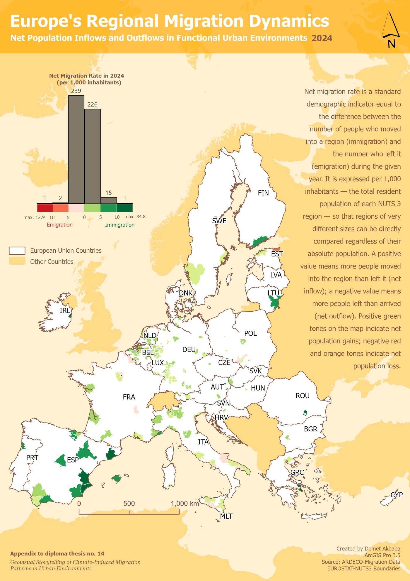
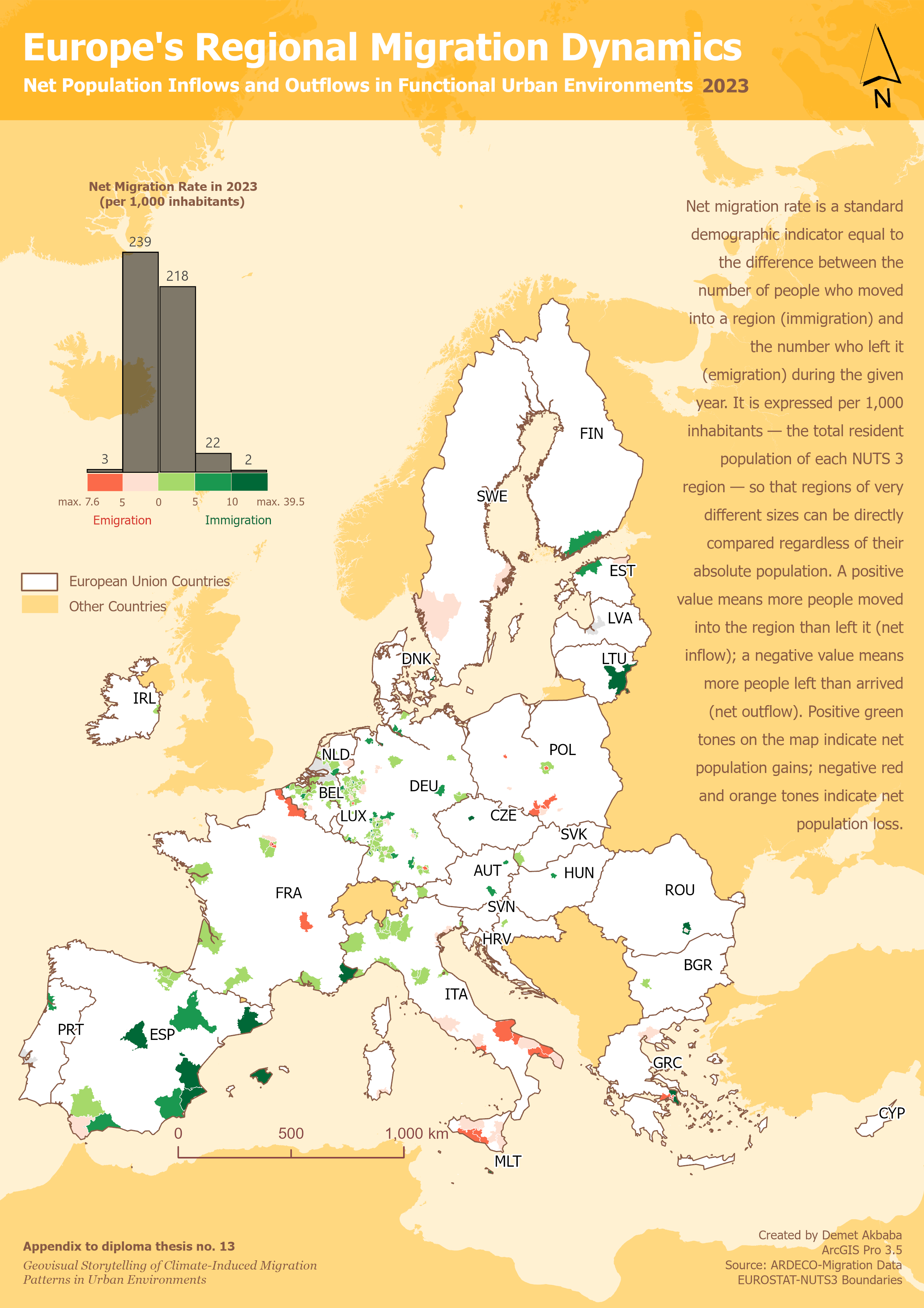
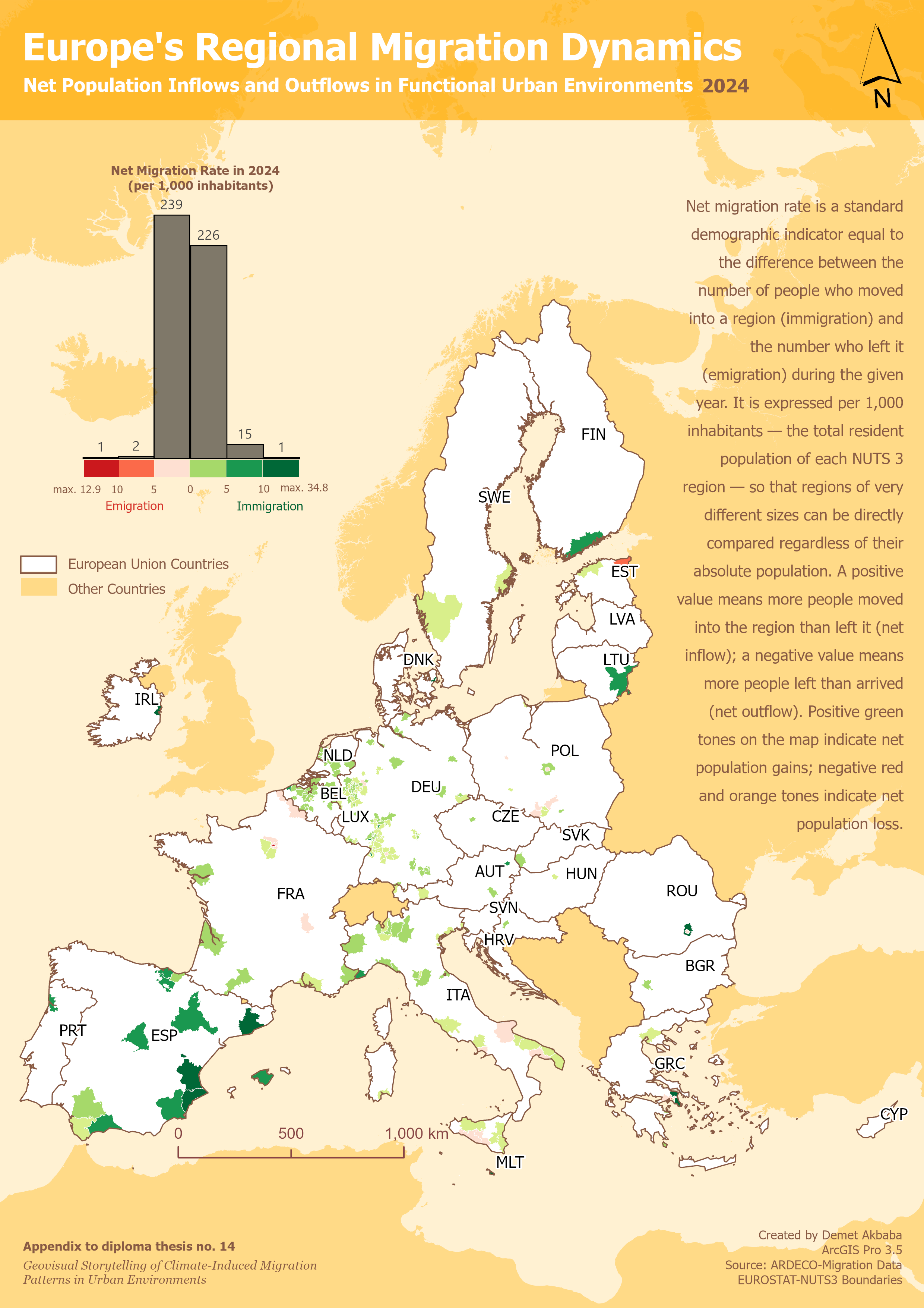
A consistent cartographic design system, combining a shared colour palette, typography, and layout grid, is applied within each case study, with a deliberate, explained register shift between the Europe and Malawi maps, reflecting that slow-onset and rapid-onset displacement are genuinely different phenomena. The 18 finished maps are exported from ArcGIS Pro and presented below in the same sequence as the thesis chapters.
Map Outputs
Click any map to open a larger version. Full-resolution appendix exports are included in the thesis attachments. Prefer a guided walkthrough instead of browsing freely? Read the maps as one connected story →
Europe Case Study: Slow-Onset Migration (2015 to 2024)
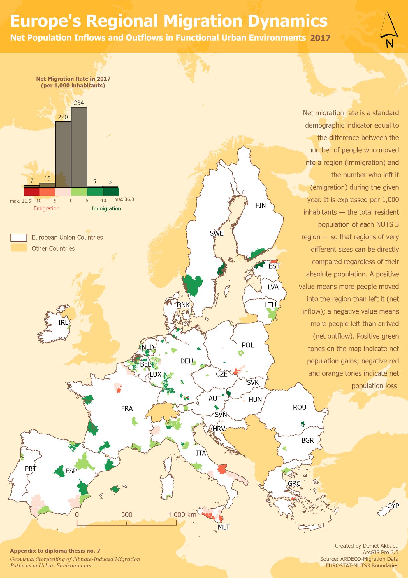
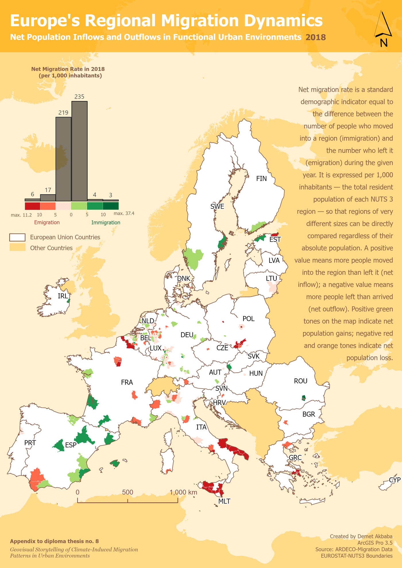
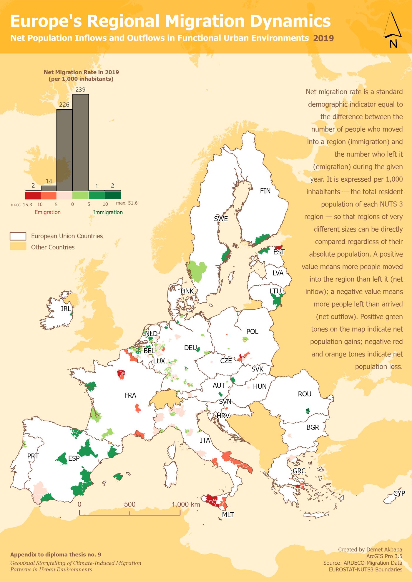
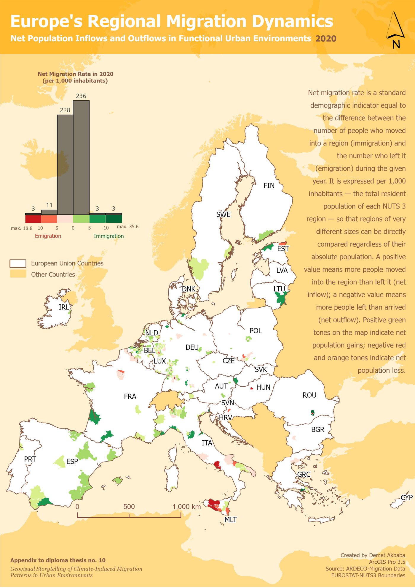
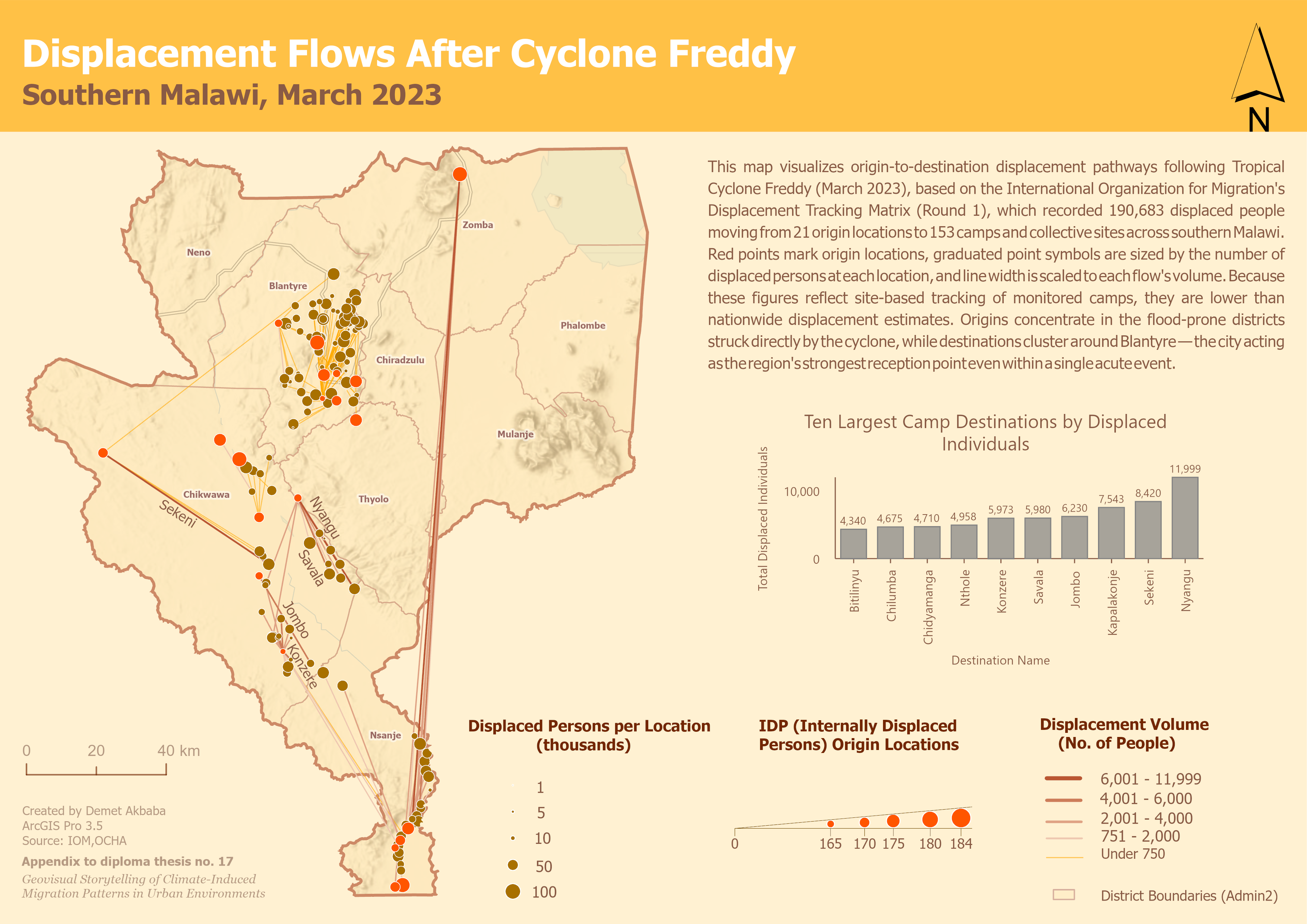
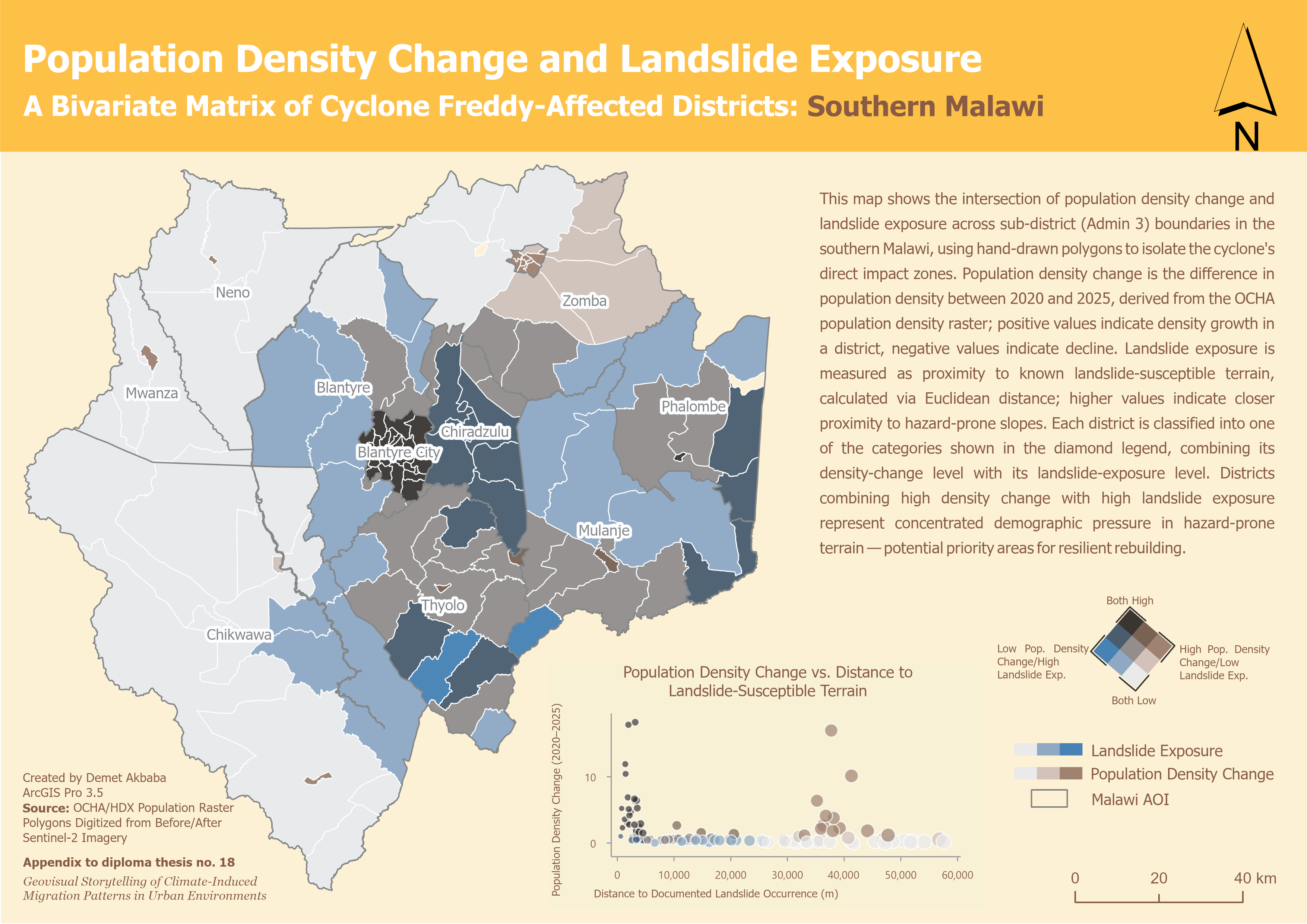
Malawi Case Study: Rapid-Onset Displacement (2023)
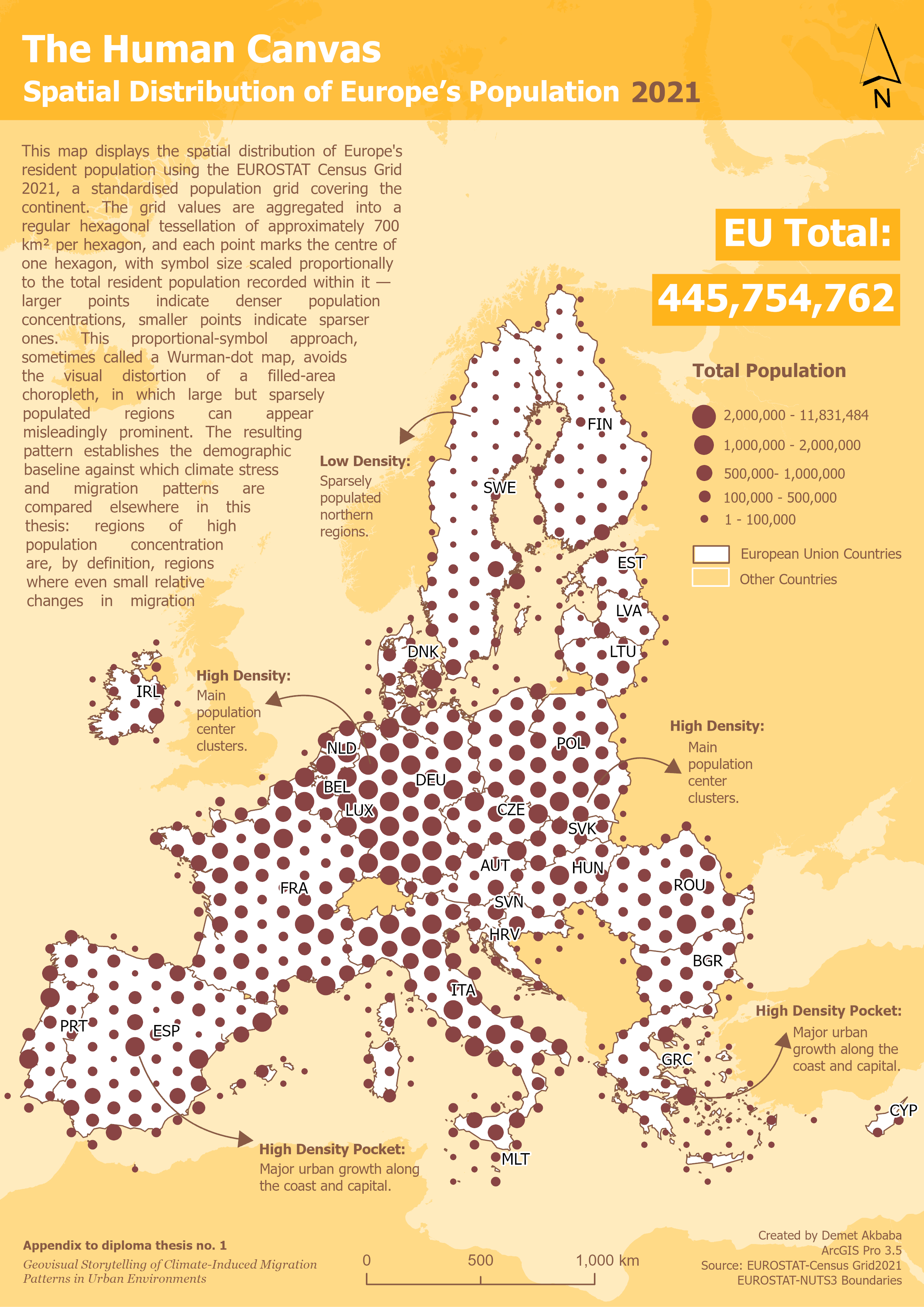
Results
In Europe, outgoing migration does not rise in the same year as the 2018 or 2022 drought shocks. A delayed rise appears only in 2019 to 2021, in a German Rhine-Main cluster of regions, but this overlaps with the COVID-19 pandemic and cannot be attributed to climate stress with confidence. The Typology maps reinforce the disconnect: severe-stress regions in Spain and, by 2022, France remain attractive immigration destinations even as their climate worsens.
In Malawi, displacement origins concentrate in the flood-prone districts struck by Cyclone Freddy, while destinations cluster tightly around Blantyre, and demographic pressure and landslide risk co-occur almost exclusively in the city’s informal hillside wards. Both patterns are presented descriptively, with no causal test applied.
Conclusion
The central result is that urban exposure to climate-induced migration takes at least two structurally different forms, depending on whether the city sits downstream of, or directly within, the climate event. Building on this, the thesis contributes a sub-national, dual-pace geovisual storytelling platform, built from more than ten complementary ArcGIS Pro cartographic techniques, for planning and policy audiences. Unlike a dashboard such as the IOM’s Climate Mobility Impacts Dashboard, it presents a deliberately diverse suite of techniques as one coherent, consistently designed story, without claiming a causal relationship between climate stress and migration.
Summary
This thesis shows how geovisual storytelling can communicate climate-induced human displacement to urban planners and policy makers, comparing slow-onset drought migration across Europe (2015 to 2024) with rapid-onset displacement in Southern Malawi after Tropical Cyclone Freddy (2023). Eighteen thematic maps, produced in ArcGIS Pro, are assembled into this website using more than ten complementary visualization techniques. Full methods and results are documented in the thesis text, available in the Downloads section below.
Downloads
Contact
Demet Akbaba
Department of Geoinformatics
Paris-Lodron University Salzburg & Palacký University Olomouc
demet.akbaba@stud.plus.ac.at